UX/UI Strategist
Building a UX strategy: as easy as playing with LEGO
UX/UI Strategist
When I was younger, playing with LEGO was my favourite pastime — and it still is. You’ll understand why after reading this article…
My very first LEGO projects were pretty basic; all I wanted was for them to be realistic — to look like the object I was trying to replicate. Then I discovered that I could use motors and more advanced systems to make my constructions even more complex.
You’ll see one major difference between these two Ferraris, even though they’re both built out of LEGO:

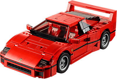
The difference? One has wheels that turn, and doors, a motor and a trunk that open, and the other doesn’t.
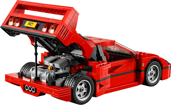
It’s so satisfying to be able to “play” with the movable pieces of this version!
It’s the same thing with user experience. You have to think about all the mechanisms, and the feeling that your digital product will give users (frustration, satisfaction, etc.) while making sure that the whole thing meets their needs.
That’s why it’s so important to build a solid UX strategy, one that aligns with your business challenges, user needs and the technological feasibility of the project.
What is a UX strategy?
A UX strategy is based on a digital vision in which you:
- Define the scope of the project;
- Establish the goals and objectives of the project;
- Propose a budget estimate;
- Determine your metrics for success (KPIs);
- Define your target users (personas);
- Obtain information on devices used;
- Identify the problems to resolve and how they are currently being treated;
- Analyze the competition;
- Evaluate opportunities to create a unique value proposition;
- Prototype a solution.
Going back to our LEGO Ferrari, you would need to have considered all the elements listed above so that:
- The final object would resemble a Ferrari;
- The final object would have almost the same functions as the original car.
This foundation dictates which tactics you’ll put in place, for example, what user research methods you’ll use. It’s like gathering the pieces you’ll need to build a LEGO car.
This approach works equally well for the construction of an actual car. Some teams specialize in motorisation, others in bodywork, etc., and each team has its own work methods.
A quick review of user experience work methods
Work methods in the world of digital have evolved tremendously, and we are now seeing collaboration give way more and more to co-creation, as we come to understand that only when the thought process happens collectively are both parties truly able to be on the same page.
The key term when it comes to co-creating in user experience is PROXIMITY:
- Proximity between client and agency
- Proximity between client and user
Essentially, the idea behind the process of co-creation is to gather all the project’s stakeholders around the table, regardless of their areas of expertise, and collectively establish a user experience strategy.
The first impulse is to use sticky notes and markers, and post them all up on a wall or whiteboard before debating what you’ve come up with as a group.
Post-it notes? Yes, but don’t go crazy!
Raise your hand if you invested in 3M! Best investment of your life! But abusing Post-it notes can be hazardous to your health. They are widely used in multiple contexts, but not systematically for the best reasons.
The rule for brainstorming is simple: one idea per Post-it, then group them together on a board or large wall.
In the case of user experience, Post-it notes are often used to create a structure, usually through card sorting, or to list the functionalities of a prototype.
However, Post-it notes hit the limits of their usefulness when:
- There are too many of them
- They aren’t detailed enough
- They require an explanation
After animating a number of workshops, I noticed that each Post-it usually requires an explanation from the person who thought of it, which can lead to some heated debates. In short, this process doesn’t favour co-creation, and at the end of the day participants spend a lot of time defending their bits of fluorescent paper without really exchanging ideas with other stakeholders.

LEGO bricks as a concrete solution
Warning: this isn’t a miracle solution to your user experience challenges, but these little bricks, with their Post-it-like colours, might just help.
The biggest difference between a Post-it and a LEGO brick is the shape. Post-it notes are all flat, whereas LEGO bricks come in all shapes and sizes, and have multiple functions.
This is what we refer to as LEGO backtalk. Each brick has its own bright colour — but also its own function. Some are static, others aren’t. Some are round, others are cubes.

This aspect of the brick is a representation of how an element can suggest its own usage.
It really gets interesting when all the participants in a workshop decide to work together towards a common goal: prototyping a solution that meets all the requirements of the UX strategy.
That might mean:
- Page zoning in the form of wireframes on a LEGO board
- Interactions between the system and the users (use case) with LEGO figurines
- A fully functional prototype combining users, functionality and colours
Much like conversion rate optimization (CRO), LEGO prototyping allows us to create multiple iterations, quickly:
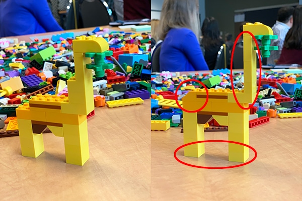
In this example, the second iteration of the giraffe received three modifications:
- The neck was lengthened
- The legs were lengthened
- The behind was rounded out
But in both versions, a primary need of the giraffe was taken into account: eating leaves.
It might seem childish but it’s actually a powerful creative tool, especially in design thinking workshops like the ones Adviso regularly holds with its clients.
To learn more about Adviso’s UX services, visit the UX page of our site.


%20(1)-1.jpg)
