CRO and Customer Experience Strategist
Everything you need to know to create an effective consent banner in 2024
CRO and Customer Experience Strategist
Let’s cut to the chase.
There are way too many articles that claim to explain how to create “the best cookie banner.” And the problem is not just that most of these articles are misleading in terms of user experience (UX) considerations, but that only a tiny minority consider the constraints introduced by Law 25, which has been in effect since September of 2023.
So how can you create the most ethical, user-friendly cookie banner possible that complies with the new legislation while maintaining performance? That’s just what we will be addressing in this article.
|
Get our checklist of the 26 best practices for designing and evaluating your consent banner. |
“Honestly, for me, the cookie banner is just not a priority”
“My cookie pop-up is just like, meh… why should I care about it now?” –Literally every manager before 2023
This is a super-legit question that any site manager has considered at some point.
But if you’re only wondering about it now after reading this, it’s because you haven’t yet understood the issues at stake and the paradigm shift that is currently taking place in the field in terms of privacy and the impact on marketing performance.
Let me quickly bring you up to speed:
|
Your cookie banner will be, and will remain, the first thing seen by a new user, or even by a returning user who hasn’t visited in the previous seven days. No matter which page they land on after accessing your site, they will be required to either agree or refuse to provide their consent for data collection. Therefore this is the exact moment, upon seeing your consent pop-up, the user will decide whether to stay or leave, and what data they will be exchanging if they decide to stay. So now, suddenly, your consent banner has become the biggest obstacle to your site’s success. If it leaves your users with a bad impression, they’ll go elsewhere. The opportunity to generate revenue with your site has just been snatched away before you’ve even had a chance to take your shot. P.S.: Fines of $15,000 CAD to $25,000 CAD apply for companies that do not comply with this legislation. |
So that’s the legal and business-related warning. If you’re still not convinced that it’s really important, we will soon be publishing a new article on the impact of a low opt-in rate on marketing operations and user experience, so stay tuned.
We’re here to discuss design and how to create a banner that works in Quebec.
To learn more about the impact of not collecting user data, I suggest you visit our section covering this issue. The good news is there are solutions for maintaining performance. Ask for advice from our experts if you’d like to better understand the scope of the new legislation and its effects on your business.
Overview of best practices
Here’s a quick summary of the top five best optimizations that you should consider for your consent banner. Don’t forget to download the list of best practices to take things a step further.
Classic vs. modal pop-up
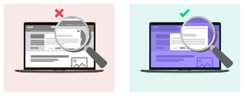
As opposed to a classic pop-up, a modal pop-up requires the user to perform an action. In our example, the X to close the pop-up is replaced by “Reject all non-essential cookies” in order to facilitate access to users who simply want to close the modal pop-up and get back to the site as fast as possible.
To ensure the modal pop-up doesn’t disrupt user experience, it needs to launch as soon as you land on the site and be accompanied by a semi-transparent shadowed background. This will focus the user’s attention on the consent banner.
Cookie H1 vs Welcome branding H1
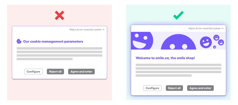
Now that your banner is the first element the user will interact with, it would be better to make it welcoming and devoid of technical jargon. It must answer in part the questions asked by the user upon arriving at your site, particularly: Am I in the right place? Is this really what I was looking for? Is it worth it to stay on the site?
Display parameters immediately vs. later
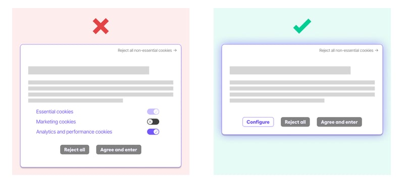
Immediately displaying cookie parameters is a common misstep. While it’s a noble intention to be 100% transparent and limit the number of clicks required to access parameters, this approach significantly reduces readability and clarity, which greatly increases the cognitive load required to understand your banner. Remember that when a user arrives on your site for the first time, you have five seconds to communicate your message and make a good first impression. This means you should prioritize clarity and relevance.
Purpose of each cookie vs. advantages of accepting cookies
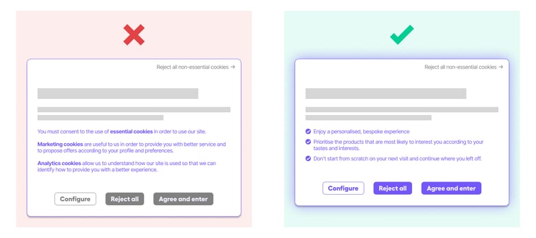
Specifics about what each cookie does is only interesting to marketing experts. Actually, 99.99% of your users are more interested in knowing why they should trust you and what value exchange you’re offering, instead of exactly what every single tracker technically allows.
3 buttons vs. 2 buttons?
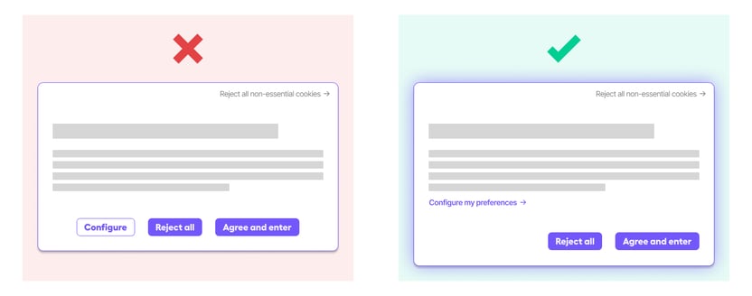
Lastly, the element that causes the biggest debate in UX, since it runs counter to our rules, is using the same button to refuse and accept cookies. This is currently what you have to do to be 100% compliant. We’re hoping the legislation will be clarified in the coming months with regard to this issue. Instead, use a clickable link or drop-down to allow the user to open the cookie configuration panel.
Conclusion
To take things a step further and verify whether your banner (or those of your competitors) is effective from a user experience perspective, you can download our list of the 26 best practices for free today.
|
Get our checklist of the 26 best practices you should be following to design and evaluate your consent banner |
Legal requirements and constraints are rapidly evolving. It’s possible that this article might even need to be updated within a year of its publication. But in the meantime, here’s our curated list of the best practices every site in Quebec should be implementing.
To stay up to date on the latest developments, you can get tips directly from Adviso’s experts by subscribing to our newsletter.
If you need to discuss your specific situation with us, don’t hesitate to get in touch.

%20(1)-1.jpg)
