


The third edition of the E-mail Newsletter Usability study , by Amy Schade and Jakob Nielsen of the Nielsen Norman Group , highlights 165 rules for designing, sending and managing a newsletter. In our previous article on this subject, we went over the important takeaways from this study. This article aims to summarize the main recommendations of the Nielsen study and identify the most important best practices regarding newsletters, from the point of view of subscription, content and unsubscription .
Our file on good ergonomic practices for newsletters contains 2 parts:
- 4 Takeaways from the E-mail Newsletter Usability Study (1 of 2)
- 12 best practices for your newsletter (2 of 2)
1 – REGISTRATION
Regarding the subscription to the newsletter, the watchwords are clarity, simplicity and transparency: let Internet users make their choices, explain to them that they can trust you, and even that they can unsubscribe. easily if they don't like your newsletter. Sending a newsletter is building a relationship of trust.
- Lead to the newsletter . The links promoting the newsletter and leading to the registration form are expected by Internet users either next to the main navigation or at the bottom of all the pages of the site. Ideally, the links to the newsletter and the news feeds (RSS) should be close to each other. In addition, the newsletter can also be highlighted in context.
- Present the newsletter . It may seem normal, but it is very important to use the word “newsletter” (or “ newsletter ”). In addition, if several newsletters are offered, their names must make it possible to differentiate them. Similarly, if some newsletters are free and others are paid, you have to think of a way to title them differently (and not just from a visual point of view). Newsletter titles must be clear and easily identifiable.
- The registration form: keep it simple! The registration form should be as simple as possible: ideally, it should only include fields for the email address and possibly the first and last name . In the case of several newsletters, favor a single page to register and group the information concerning all the newsletters. If more than 10 newsletters are offered, organize them by family.
- More information for more confidence . Specify during the registration process what the possible options are - text or HTML, frequencies, etc. - and let the Internet user make his choice. Propose links to the Privacy Policy and the FAQ (think about questions on the registration/unsubscription procedure, what will be done with personal data, etc.) Remember to confirm to the Internet user that his registration has taken into account: if possible, send them the last newsletter published, and announce the date on which they will receive the next one.
- Avoid temptations . It can be tempting to ask for a lot of personal information about the Internet user, whether to get to know him better or to offer him the opportunity to personalize his newsletter. Keep in mind that the longer the registration process, the less positive the satisfaction will be . Another attractive pitfall could be to link subscription to the newsletter and subscription to the site (whether it involves forcing the Internet user to register on the site to receive the newsletter, or to oblige the Internet user to subscribe to the newsletter when registering on the site). Internet users who receive unsolicited newsletters (including those they don't remember signing up to) will probably report you as spam, and your newsletter may be blacklisted .
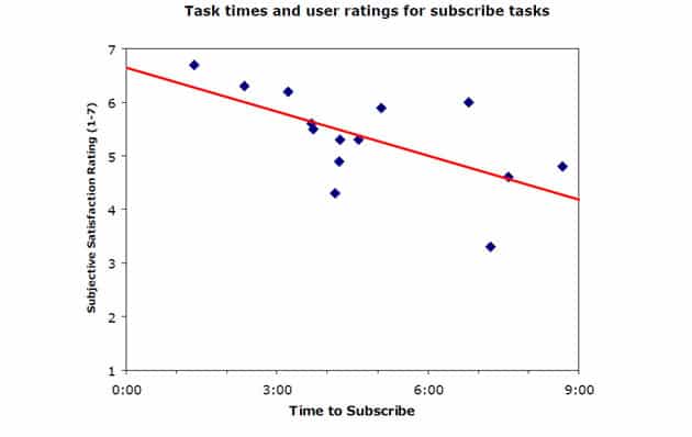
-
Illustration of the correlation between time required for registration and satisfaction: the longer the time required, the less positive the satisfaction. (Source and ©: Email Newsletter Usability, Third Edition, Nielsen Norman Group)2 – CONTENT AND PRESENTATION
Once the Internet user subscribes to your newsletter, he has high expectations, which must be fulfilled even better than on your website! How do we do it ? By avoiding the superfluous and flashy! The watchword is: to impose by the content and not to irritate by the form.
- Honor promises . The newsletter should be sent at the planned frequency, with as few variations as possible. The content should remain focused and specialized in relation to the subject of the newsletter (do not stray), and, as much as possible, the content should be topical (the rapid communication of current topics, for example before a magazine , is one of the reasons why readers love newsletters). To this end, remember to link certain content with current topics , and to choose your topics according to the news of the area concerned.
- Identify yourself, reassure . Always remember that your newsletter will not be alone in your reader's inbox, and will be chosen or discarded based on subject and sender name. The name of the sender must, with exceptions, be the name of the company, and not change over time. The subject should be treated as a title ( headline ): catchy, but already informative (maximum 50 to 60 characters, including spaces). In the body of the email, make sure the company name is always visible, even when images are disabled. In a previous article on the Adviso blog, Jean-François V. even mentioned adding a “security” logo to the newsletter (like Visa, Hacker Safe, etc.).
- Take care of the content . It is above all for its content that the reader subscribes and reads your newsletter. Forget uninformative images and overworked layouts: differentiate yourself through content . On the content first, by choosing current topics, relating to the area concerned by the newsletter, but also by writing (if possible) content specifically for the newsletter. On the form, then, by limiting promotional phrases and avoiding mistakes, by including two short articles and real content (not just links to the site). Remember to include the date of the newsletter and the name of the company. To promote readability, prefer short and concise content, use titles, bolding and bullet points.
- Help readers use the newsletter . The newsletter must always offer a link to unsubscribe (as we mentioned, omitting this one would only increase your risk of being considered spam), for example at the bottom of the newsletter. Also remember that readers can forward the newsletter (to colleagues, friends, etc.): offer a direct link to forward it, and a link to print it. Also with this in mind, include a link to register as well.
- Avoid being considered spam . Always mention in the newsletter why the reader received it (registration on the site, automatic registration for the company's internal newsletter, etc.) Write the subject, avoiding the vocabulary and punctuations often used by spam , and avoid overly promotional capitals and phrases. Offering a visible and easily usable link to unsubscribe allows the reader to stop receiving the newsletter without declaring it as spam: that's the whole point. As much as possible, send the newsletter on a regular basis, so that the reader expects to receive it, and consider giving notice of the date of the next mailing.
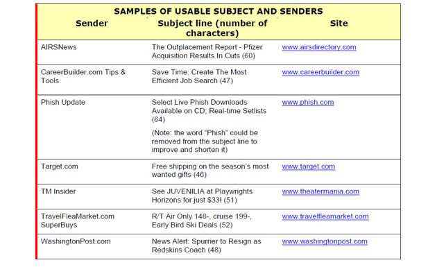
-
Examples of effective sender and subject names. (Source and ©: Email Newsletter Usability, Third Edition, Nielsen Norman Group)
3 – UNSUBSCRIBE
The opt-out process should be separate from the opt-in process. Just like the latter, avoid the superfluous. Consider offering an alternative to unsubscribing , such as a way to change the frequency of receiving the newsletter.
4 – NEWS FEEDS (RSS)
We begin from this article to follow one of the main recommendations concerning news feeds : given that few people know what the term "RSS" means, even when they use this process, it is strongly recommended to use the term “news feeds” . This point is made here because newsletters and news feeds are considered similar in their usefulness, and links to them should be close together on the website. Finally, consider including an explanation of what news feeds are on your site.
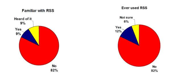
-
Knowledge of RSS: 82% of the people studied were not familiar with this term, and only 12% of them were sure to have already used RSS. (Source and ©: Email Newsletter Usability, Third Edition, Nielsen Norman Group)
In conclusion, our previous article highlighted the importance of the newsletter for the reader-business relationship. The 12 points above are a summary of the main recommendations of the E-mail Newsletter Usability study , and identify best practices for designing, sending and managing a newsletter. If only three watchwords were to be retained, remember: transparency, relevance and simplicity (content and use).
To learn more about the E-mail Newsletter Usability study:
Visit the Nielsen Norman Group website: www.nngroup.com Read the study summary and table of contents E-mail Newsletter Usability (from the Nielsen Norman Group website. The study can be downloaded online for $398.)