The home page of your website plays the same role as the window of your physical stores. For a new customer, your home page should allow him to understand your offer at a glance and how it differs from that of your competitors. However, for a recurring customer, this page must also present the new features that should interest him.
These different needs can be met with seven must- haves that you should feature right on your homepage. I propose today to make the list with you.
1. YOUR MARKETING POSITIONING
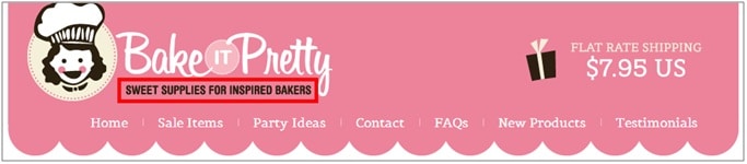
Your marketing positioning summarizes what you offer and to whom you offer it. Sometimes your brand name can be telling enough for people to guess your offering, but never take anything for granted. Add a short tagline or brief description near your logo to explain (in pretty words) the very essence of your business (example: Bake it Pretty ):
2. YOUR OFFER
Your offer is your products and/or your services (their brands, their categories and their reasons for being). By putting your products forward on the home page, you reinforce your positioning by demonstrating it. If we take the example of Bake it Pretty , the products that are put forward (in the carousel or in the featured products ) make us understand that the offer is not aimed at professional pastry chefs, but at cupcake makers in the sunday :
![]()
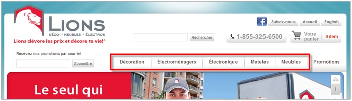
You can also present the categories of your products directly in your main menu (this practice is excellent for your SEO). Your new visitors will better understand your offer and your loyal visitors will quickly find what they are looking for (example: Lions ):
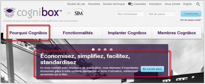
Everyone understands why they should buy a cake pan or a chair, but the answer is sometimes less clear when offering specialized or unfamiliar products. If this is your case, don't forget to present the reasons why it is beneficial to use your product or service. You can do this in your carousel or by adding a clearly visible tab in your main menu (example: Cognibox ):
3. YOUR COMPETITIVE ADVANTAGES
Your competitive advantages are the reasons why a customer will prefer to get what he is looking for from you rather than from your competitor. We are thinking here of the low prices, the speed of delivery, your return policy, the quality of your products, etc. Do not hesitate to highlight these benefits on your home page. They are reassuring for the new buyer and allow repeat buyers to confirm that they are doing the right thing by choosing you (example: Clearly Contacts ):
![]()
4. YOUR NEWS AND PROMOTIONS
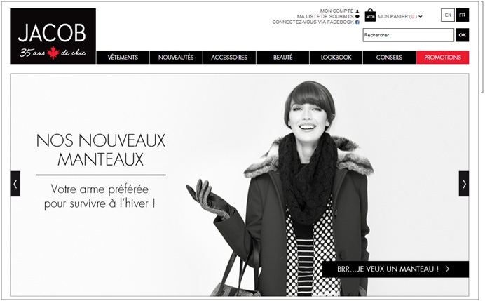
Your novelties and your promotions are excellent excuses for a customer in love with your brand to buy again. So put them forward! To do this, most sites now have a carousel on the home page or a clearly identified "promotions" tab (example: Boutique Jacob ):
5. CUSTOMER SERVICE CONTACT DETAILS
Highlighting your customer service and contact information reassures your new visitors and helps retain your current customers. A new customer will be delighted to find that he can easily contact one of your employees to ask him questions or when he faces a problem. A recurring customer, on the other hand, will feel safe during his transaction, which will improve his perception of your company (example: Clearly Contacts ):
![]()
6. WAYS TO TAKE ACTION
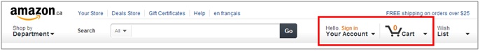
Your visitors must understand the ways in which they can take action (buy, call, download, etc.). So, clearly present your calls to action and the functionalities of your site related to e-commerce. The shopping cart, for example, should always be visible, even if it is empty. The shopping cart confirms that we can buy online on your site. Group the other functionalities related to e-commerce around the shopping cart, such as the creation of a user account, for example (example: Amazon ):
7. THE MARKETS YOU SERVE
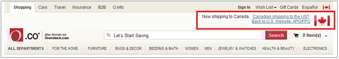
There is nothing more frustrating than finding what you are looking for only to realize that delivery to Canada is not possible. Confirm to your visitors that you deliver to the country in which they are located (example: Overstock ):
In conclusion, I want to remind you that your site should in no way look like a pizza all dressed with extras. Give due importance to each of the elements presented above, but do not overload your home page (to do this, rely on best practices in ergonomics ). The purpose of your home page is to redirect your visitors elsewhere on the site: it is therefore normal that this page does not inventory all your content.
%20(1).jpg)
-2.png)