


 Jean-Sébastien just spoke in his post on performance indicators for e-commerce about the importance of measuring the completion rate of the payment/confirmation process. He suggests including all the steps except adding to basket because many add items as a reminder, or simply to see the total in the basket (so many retailers lack transparency on the cost of delivery). But once we spot this behavior, how do we make sure it doesn't negatively impact our sales?
An interesting approach is that of Re-Commerce which plans to list the causes of abandonment (the article is too expensive, the article was not in inventory, the customer was only shopping, etc.) and to present a tactic responding to each of these main reasons. In this case, what tactics to adopt?
1. Involve a human presence
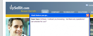
I experienced it this very week. I had registered on a B2B commerce site to download an item. Seeing that I had downloaded the article and browsed all sections of the site for a good five minutes, I received a call asking me if I had had any difficulty finding the information I was looking for and if I needed the assistance of a sales representative. The lesson: the online customer, like the in-store customer, likes to talk to a human without being harassed.
2. Offer alternatives to payment or abandonment
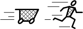
As Jean-Sébastien clearly points out, adding an item to the cart without proceeding to payment does not necessarily mean that the payment process is flawed: people want to shop. In such a case, I see several ways out so as not to waste the shopping effort that the user has just made (both for him and for us):
- Preserve an abandoned cart for the next visit;
- Warn the visitor who leaves that his basket can be saved if he connects;
- Send a reminder by email including the names and images of some items in the basket (it is recommended to leave a period of at least 24 hours so that the user does not feel observed);
- Propose several lists that act as “semi-baskets”: wedding registry, gift ideas, registered items, etc. Include a call to action urging the user to pass these items from one list to another, and, above all, to the basket.
3. Create a sense of urgency
By clearly publishing the delivery times to involve the customer ("If you order within 2 hours, your items can be delivered by Thursday!"), by offering a discount or a bonus for a limited time, by evoking the upcoming major holidays and events (how many TVs sell in the weeks leading up to the Superbowl?), etc. In Call to Action, the Eisenbergs mention this strategy as Dell's key trick to increasing conversion.
4. Improve smoothness and transition between screens
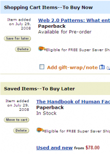
I had slipped a word in my recent article on the possible feedbacks to an addition to the basket. The main thing, from this perspective, is to help the user find the basket, and to constantly show him the state (contents) of the basket. For example, the “basket” icon is more quickly assimilated than text alone and is a good complement to the simple link to the basket; the use of a persistent mini-basket or an indicator of the number of articles in the basket also makes it possible to remind the user that he has started placing articles there. Remember that in a "brick" store, the user can always see both his basket and the shelves, then his basket and the checkout... the behavior of the online basket, although it is gradually becoming a convention, always remains perfect to ensure fluidity.
5. Emphasize process security and be transparent
Delivery times, cost of transport, countries covered by the store and security and privacy features should no longer be a secret for users accessing the shopping cart. In addition to reducing frustration, we can thus measure the use of the basket for what it really is: a step towards payment. If the basket has more than one use and objective, it will be difficult to clearly identify its shortcomings or to prioritize them. Why not offer free shipping to users who purchase more than a certain amount?