A new “innovative” search engine
At the beginning of the year a new search engine was launched, Hooseek .

Hooseek is a meta engine that returns results from Google, Yahoo, Ask, and Live. (Finally soon may be only Google, Ask and Live, if the takeover offer of Yahoo by Microsoft is accepted).
The question that arises is to know what the designers of Hooseek have added to their engine to hope for a place in a very saturated market.
The answer is simple, they offer “innovative” features. Currently there are 7 of them presented in an "innovation" section with difficult access:
- The job search, which is in fact a classic search on a job site such as workopolis,
- The image search which is also relatively basic,
- The web search that I don't need to comment on,
- The "seeker", which is in fact the automatic loading of search results when the user scrolls his screen. On Hooseek the concept of a results page has disappeared and we therefore have an “endless” page,
- The "seekeasy" which is in fact a search basket in which certain results can be stored for reuse,
- The Dico search, which allows you to search for definitions, synonyms and even to have the conjugations of words,
- Seekcare, which is actually more of an internal policy than a feature, helps raise public awareness by offering users the choice of Non-Governmental Organizations (NGOs) that will receive donations for each search performed.
In view of these descriptions it is difficult to speak of real innovations. Admittedly, Seekcare is a very interesting choice and an ethical gesture that will not leave us insensitive, but this strategy does not target a large enough audience to be effective.
The seeker, on the other hand, does not really respect the ergonomic rules for presenting search results. The designers relied on the fact that "As a general rule, 40% of requests are only satisfied from the second page" unfortunately this does not really justify the creation of an "endless" page in which users are left without a landmark during their navigation. In my opinion, this feature is more of a gimmick than an innovation and does not represent an improvement for the usability of the search results pages.
The seekeasy is also a questionable feature. Indeed, if users want to compare several search results, they tend to open them directly in tabs (or windows) rather than 1) store them and 2) open them in tabs (or windows).
The seekeasy only adds complexity to a task that users already do efficiently.
More generally, this engine has a few points that could be improved:
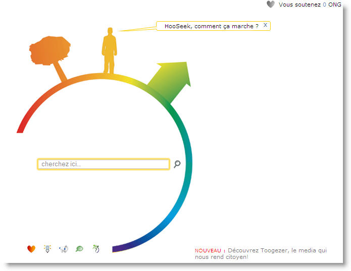
The homepage does not present any major problem, however the icons of the sections of the site could be more visible (with permanent text rather than in “rollover”) and a button labeled “search” could replace the magnifying glass.
![]()
The results page is more problematic:

Access to “innovative” features is difficult, firstly because the icons used (on the left) are not all representative and secondly because they are far too small. Moreover, the role of the icons on the right is not obvious, they actually allow you to know the number of results obtained on each searched engine.
Finally, the feature that interested me the most is the Dico search. Of course, I found the "seekcare" initiative very interesting, but unfortunately this is not what will make me change my research habits to mainly use Hooseek. Despite everything it is a very young site and it is not excluded that they will surprise us with new really innovative functionalities in the future.

-2.png)


