The 5 levels of site optimization (part 3 of 3)

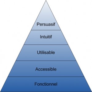
In this last part, we are going to make the link between the needs of your users with your marketing, commercial, informative or associative needs since the last three levels that we are going to see range from the point of view closest to the user, that is to say Web ergonomics, from the most marketing point of view, which is the level of persuasion of your Web site.
However, if you have not yet reached steps 1 and 2 of the optimization pyramid (see part 2 of this article ), it would be useless to want to put resources on ergonomics and on optimization since those -these would improve the more "abstract" layer of your site while its "material" layer would not work correctly. This would therefore inevitably have a negative effect on your users and therefore on your conversion rate, even if the persuasion part is excellent.
LEVEL 3: YOUR SITE SHOULD BE USABLE.
- Buttons should be easily accessible so don't imitate the carousel on the Opera Australia website
- There should be a good ratio between the number of categories in the menus and the number of items in them so as not to obtain abstract categories which group together items which no longer really have a relationship with each other.
- If there is an internal search engine, it must be a minimum of performance. Avoid listing only one or two shows corresponding to the dates sought among a list of 8 others that do not have a report as the Sydney Opera House site does.
- Basically, respect the rules of Web ergonomics. You can have a good introduction on the subject with Nielsen's article " Usability 101: Introduction to Usability " or his " top ten mistakes in Web Design "
- From a marketing point of view, it will be the use of the right calls-to-action, linked to the objectives of the site in the right places with the right labels.
Consequences :
- They will find your site difficult to access and complicated
- They will look elsewhere if they cannot find another competing site that will be easier, more affordable
LEVEL 4: YOUR SITE SHOULD BE INTUITIVE.
Your site navigation should be smooth. Users should experience no friction in achieving their end goals.
- Avoid unnecessary pop-ups
- Balance the layout
- Have user reviews
- Reassure about delivery costs, warranty, etc.
- Anticipate user questions by answering them in your content
- Answer the right questions in the right places, where users ask them and not elsewhere in order to limit noise and strengthen the signal of your communication
- Optimize forms (especially on lead-generating sites)
Result :
If your site does not reduce friction in user navigation, you will ask them to use their intelligence to navigate your site rather than to achieve their final goal. Thus, he could simply be captured by the ease of achieving their goals on another site when they are in the exploration and research phase preceding any phase of selecting a solution.
LEVEL 5: YOUR SITE COULD BE PERSUASIVE.
The persuasion strategies on your site will generally have the most impact on your conversion rate. However, they will only work with a sufficient base in the lower levels of the pyramid. It's clear to everyone that even if I'm convinced that I want to buy an opera ticket, for example, I won't be able to buy a single ticket on the Sydney Opera House site since I can't reach the product page a spectacle. Similarly, on the Opera Australia site, I wouldn't want to enter my credit card information until it was secure.
To improve the persuasiveness of your site, you could:
- improve content writing
- improve product photos
- put short videos that go around your solution
- offer demonstrations
- display testimonials, case studies, etc.
- ensure that all your texts are written with the main persona of this page as the first target, taking into account the stage where they are in their buying cycle.
It is clear that a site of a known and appreciated brand or a site that has a monopoly will have an ever higher level of persuasion. However, you can always improve this level in order to become a must-have.
CONCLUSION
With this quick, but long overview of the basics of optimization strategy, I hope it has given you a better idea of the level of priority you should assign, by default, to each of your tasks to be carried out on your website. .
Indeed, it is clear that this first overview is general and must be readjusted according to the type of site, according to the objectives of the site, according to the personas and the tasks of the user on the site, and finally according to the objectives of the company behind the site.


.jpg)


