Reducing shopping cart abandonment has been a prime concern for a number of years. According to 29 independent studies, the average shopping cart abandonment rate in 2014 was 68%, which indicates that this is still a serious issue. Here are some tips to help you get conversion rates up for your online store, and avoid abandoned shopping carts.
Minimize the number of steps in the checkout process, and include a progress indicator to let users know where they are in the process
After 5 steps, a user might decide the process is too long. But, since much of our sense of what constitutes “too long” is based on how much we are asked to do in each step, a laborious purchase process could influence your completion rate more than the number of steps.
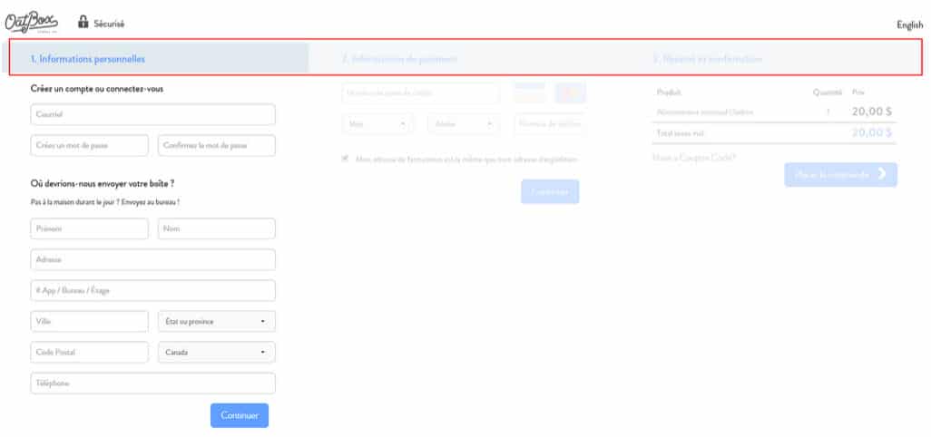
Source : Oatbox.com
Allow users to complete their purchase faster by offering a guest checkout option
I know you want to encourage as many users as possible to become members of your site, but be careful not to interrupt the logical progression of the checkout process. When a user clicks “proceed to checkout,” that’s exactly what they want to do. If they are then presented with a form to fill out to become a member of the site, they will see this as a necessary step in the purchase process. Do you really want to send the message that only a member of your site can make a purchase?
To incite people to create an account, instead try asking permission to keep their personal information on file for next time – but ask only after they’ve completed their payment and confirmed their purchase. And emphasize the advantages of creating an account – you want to position yourself as offering a benefit, not asking them to complete an onerous task.
The same logic applies to asking users to sign in to their accounts. “Already a customer? Sign in for faster checkout” allows users to understand the benefit of signing in.
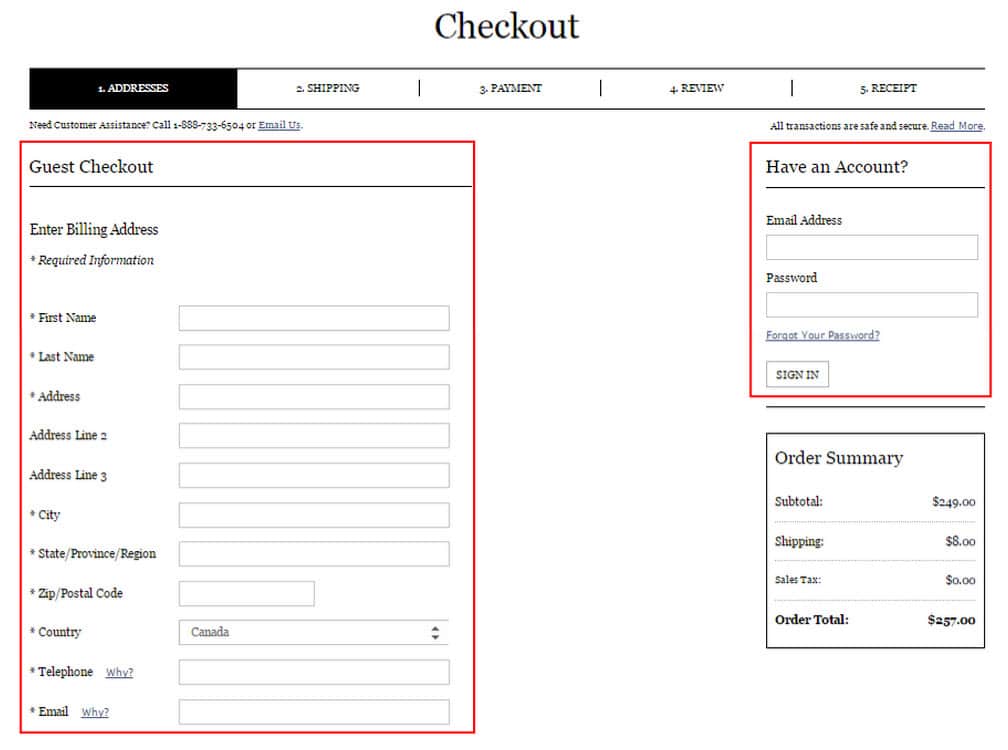
Source : Clubmonaco.com
Inline error validation messages
Imagine this: you’ve just filled out a long, exhaustive form, you click “Order” and you wait. But then, instead of getting a purchase confirmation, an error message appears, indicating that you’ve entered invalid information. So disappointing! Inline error validation, done field by field and in real time, allows you to minimize errors, reduce cart abandonment, and lower the all-around frustration level of your users. Email addresses, postal codes, and credit card numbers are all elements that can be automatically validated in real time.
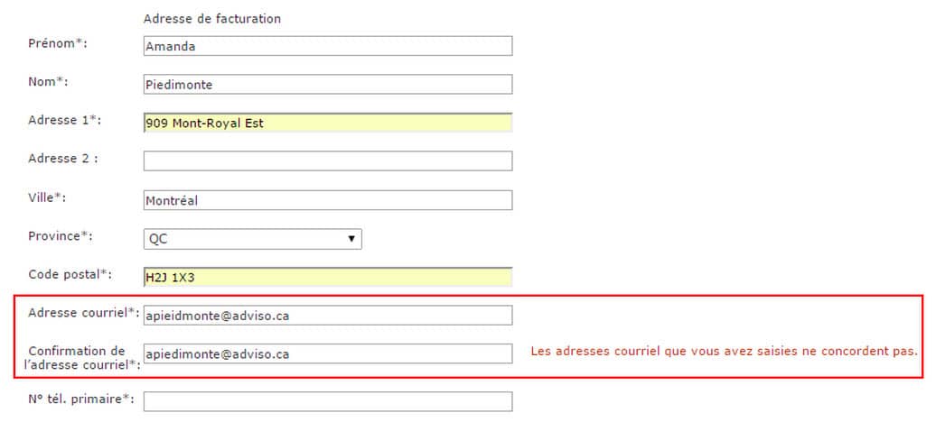
Source : Ikea.com
Confirm stock before adding items to the shopping cart
Avoid unpleasant surprises when the buyer gets to the end of the purchase process, and confirm that the inventory is in stock when the item gets added to the cart, and again when the order is placed. When an item is added to the cart, reserve it for a set period of time, and communicate that to the customer.
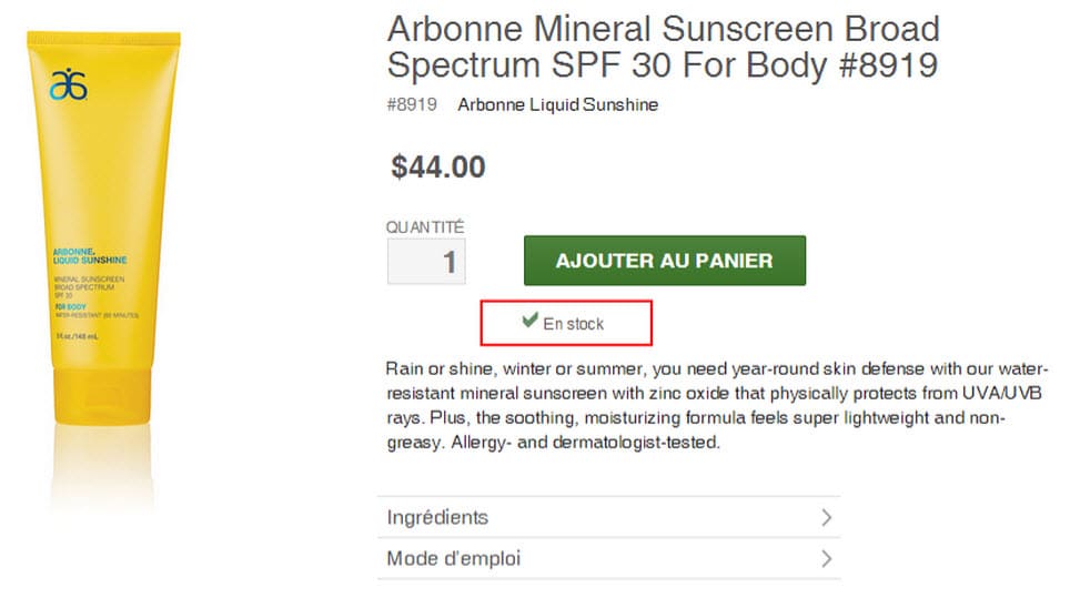
Source : Arbonne.com
Allow users to purchase directly from the search results page
Generally, users who search for a specific product are highly motivated buyers, close to being ready to convert. Help make it easy for them by including a “Buy now” link directly in the search results page, and above all, track how this link is used.

Source : Walmart.ca
Monitor (or reduce!) page load time
A healthy website should aim for a page load time of 3 seconds or less. The majority of users will leave a site rather than wait for a page to load. These users are unlikely to return to your site after experiencing this type of frustrating delay. In many cases, a bad online experience can even affect the overall perception of the company.
Avoid asking for information you don’t need!
Never ask for the same thing twice, or if you do, then auto-fill the fields with the information you’ve already collected. For example, since a person’s delivery address is often the same as their billing address, offer the option of automatically filling these fields to avoid forcing people to enter duplicate information. No one likes to provide more of their personal information than they need to, so make sure that every field you ask a user to complete is genuinely useful. If you ask for a phone number, explain why or what you plan to do with it.
Don’t forget to test your forms on mobile and tablets to avoid the frustration that can arise from processes that haven’t been optimized for these devices. If you require phone numbers to be formatted with hyphens, or postal codes to use capital letters, you risk irritating mobile users by forcing them to switch back and forth between keyboard views to fill a single field. Opt for minimalistic form design to increase conversion rates.
Source : Toysrus.ca
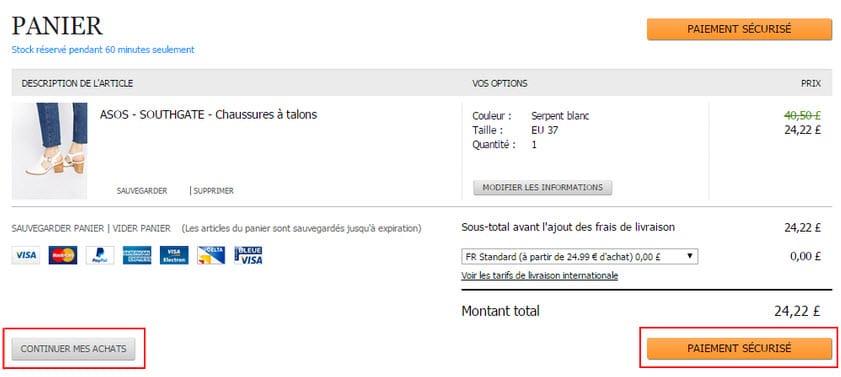
Minimize calls to action, and be specific
Be careful not to bombard users with calls to action. Keep it simple, and avoid subjective calls to action, like “Continue.” Better to use words that aren’t open to interpretation, and do a better job of managing users’ expectations, like “Pay now,” “Continue shopping,” and “Confirm your order.”
Source : Asos.fr
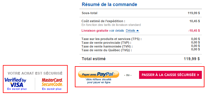
Reassure users about security concerns
Clearly indicate which are secure fields. Even if there is a discrepancy between customers’ perception of security and what the actual security badges represent, they still allow you to reassure users about the security of their online purchases, and consequently increase conversion rates.

Source : Toysrus.ca
As well as heeding the above tips, it’s also important to think about developing marketing strategies to remarket to users who have abandoned their carts. My former colleague Véronique wrote an article on how to use email marketing to reduce shopping cart abandonment.
What about you? Have you made any changes or improvements that have helped reduce your abandonment rate?
-2.png)