Harness the power of Excel for your web-analytics dashboards
Any good manager uses tools to measure the performance and return on investment (ROI) of their website, mobile applications and marketing actions.
However, it faces several challenges:
- The data is dispatched in several reporting tools which do not communicate with each other (web-analytics solution of the site(s), advertising management, social media, internal tools, etc.);
- All the people having an impact on the company's web strategy do not have the same interest in performance measurement or the same mastery of the tools available;
- The web is evolving very quickly, your business model is constantly adapting and a rigid tool quickly becomes outdated;
- With the era of big data looming, the proliferation of data sources is just beginning
Thus, having a dashboard that gives an overview is necessary to understand your customers and manage your web strategy.
THE IDEAL DASHBOARD
But to be truly effective, this dashboard must be based on your company's business objectives, be simple and quick to update, actionable (to enable decision-making) and engaging (to ensure a good rate adoption). It must also be scalable so that it can adapt to changes in your company's strategies without starting from scratch each time.
CURRENT SOLUTIONS FOR CREATING A PERSONALIZED DASHBOARD
To obtain such a dashboard, we have identified 3 solutions:
- Build a completely customized solution; but it is an expensive choice;
- Use web dashboarding tools provided for this purpose; but the solutions still lack maturity;
- Use the power of Excel.
This is the 3rd solution that we will retain for this article. Ideally you will need a resource who is proficient in Excel and who has skills in data visualization, statistics and ergonomics. We therefore want to help you identify all the points to consider in order to build such a dashboard.

STEPS TO CREATE A WEB-ANALYTICS DASHBOARD
PRELIMINARY STEP: DEFINE YOUR KPIS AND VISITOR SEGMENTS
The purpose of a dashboard is to bring together in a single interface the indicators and metrics that should allow you to assess the performance of your web assets at a glance. Thus, to encourage decision-making (be “actionable”), your dashboard must be aligned with your company's business objectives and offer different levels of reading.
The first step therefore consists of defining around ten key performance indicators (KPIs) and identifying your visitor segments. To respond to internal issues, we can eventually define a short list of additional metrics that will aim to satisfy the “ Hippos ” .
STEP 1: DATA AGGREGATION
This step is mostly technical. The objective is to be able to quickly and simply aggregate data from different sources (Google Analytics, DoubleClick, Facebook Insights, Bit.ly, YouTube Analytics, etc.). This aggregation should ideally be automated to allow end users to be autonomous with the dashboard.
To date, the possible solutions are:
- Connection to the APIs of the various analytics solutions
- The connection with a database that would be filled by APIs
- Using csv export files
STEP 2: STRUCTURING THE DATA
Your Excel file should be kept clean and well organized. That is, the raw data should not be mixed with the analysis part. The challenge is to build the basis of an easy-to-interpret and usable dashboard.
For this, the report must visually highlight the relationships between the data and offer different levels of reading. It will therefore be necessary to provide:
- A tab for raw data
- A tab with a consolidated view of KPIs
- Tabs with detailed views that allow you to answer specific questions
- Offer on-the-fly segmentation possibilities (by selecting a segment from a drop-down menu for example)
STEP 3: DATA VISUALIZATION
Visualization is an overlay that will improve your report. Its purpose is to make it more engaging and to guide the user in interpreting the data.
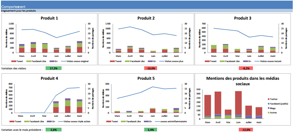
This visualization is done using graphs and variation indicators in the tabs dedicated to analysis (consolidated view of KPIs and detailed views).
To succeed, you have to use good ergonomics/web-design practices, make the dashboard dynamic, relate the data to the company's/teams' objectives, highlight the variations.
CONCLUSION
You have now understood all the concepts and the main steps leading to the creation of relevant, actionable and engaging dashboards. Now all you have to do is apply them by arming yourself with courage, patience, and trial and error.


%20(1).jpg)


