Customer Experience Specialist
4 reasons to get serious about your landing pages
Customer Experience Specialist
Second article in our February series dedicated to landing pages. After recalling the definition of these landing pages , let's see why you should seriously work on your pages today.
1. BECAUSE YOU ARE LOSING MONEY
Conducting a marketing campaign without a specific landing page will inevitably make you lose money. Why? The best example comes from Adwords. On Adwords, your quality score is a very important variable that strongly influences your average position, and therefore your expenses. In fact, your average position is calculated based on two main variables: your quality score and your bid. So if the first is low, the second must compensate. Thus, a quality score of 4 leads, for example, to an increase in the cost per click of 25% on average.
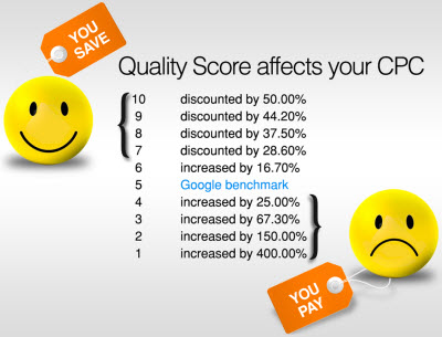
Source: Wordstream
So how do you increase this quality score ? Well to sum up, the score depends on three big factors: your ads, your keywords and… your landing pages! To increase it, you must therefore optimize these three main factors, including your landing pages , and not focus only on what can be optimized from the Adwords platform. If I roughly summarized everything, I would say that: non-optimization of landing pages = non-optimal quality score = higher CPC (than it could be) = lost money. Too bad, isn't it?
To learn more about the relationship between landing page, quality score and savings, read this article by Simon who already talked about it… in 2009! And for more details on what factors Quality Score depends on , this Wordstream article is a good summary.
2. TO INCREASE YOUR CONVERSION RATE
You are now convinced that you NEED a landing page for your Adwords campaigns. It's good. But beware, not just any landing page . As mentioned in my previous article, the latter must be dedicated. Why?
It's time to introduce another concept developed by the Unbounce team: the attention ratio . “The attention ratio is the ratio between the number of things you can do on a page [= links to click] and the number of things you would have to do [for our goal to be achieved].”
Here is the illustration of this concept.
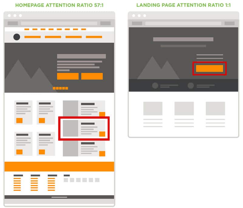
Source: Unbounce's Attention Driven Design ebook
Left , a mockup based on the Virgin Mobile USA homepage in 2015; this page had 57 links ( attention ratio = 57:1). If the campaign you are promoting is “Promo 2” (boxed in red), not only will it be hard to find among all the other offers, but it will also compete with all the other elements on the page, increasing the chances that your prospect clicks on one of these “competing” offers or leaves the page, overwhelmed by so much content. Either way, your campaign fails.
Why would it fail if the prospect clicks on another promotion? A sale is a sale, right? NOPE! If your prospects do not interact with the campaign you are promoting, your Adwords statistics will show a failure since “Promo 2” is not the one that converted.
On the right , a mock-up of a landing page (campaign). There, it becomes very clear that there is only one thing to do on this page: the attention ratio is a perfect 1:1 and the objective of the page is much more understandable.
OK, that's all well and good, but are we sure that lowering this attention ratio will increase the conversion rate? YES:
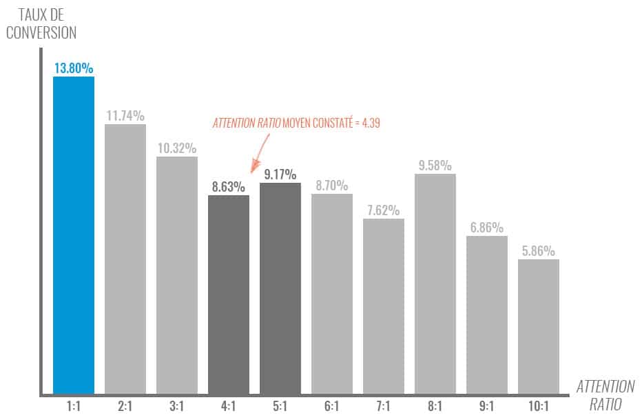
Data extracted by Unbounce from their database of landing pages. Sample of 20,000 active pages with forms. Links in the footer are excluded (T&C, Privacy, etc…). Source: Unbounce.
3. TO BE CONSISTENT WITH USERS
What happens if you make a nice promise to a child but don't keep it? He'll always shun you (unless you give him a big bag of candy). It's the same with your users. If you make them a promise in your ads and calls to action, there's nothing worse than breaking it and disappointing them.
What do I mean? Example. I am looking for auto insurance quotes. So I do a query on Google and find a Desjardins ad full of promise.
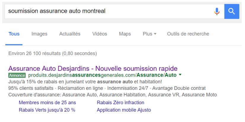
I am told that it will be “fast”, that I will have a discount and that 95% of the customers are satisfied. I click. And this is where it goes wrong:
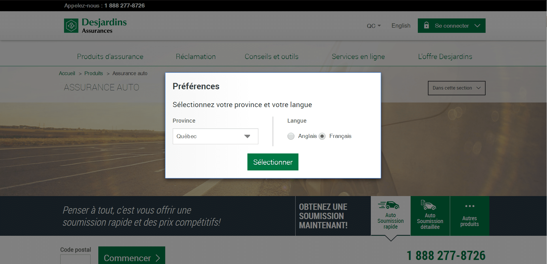
First, a geolocation barrier. Nooooooo. But let's stay on topic. I select my province and my language, then I land on the “ landing page ”. I quickly scan the page, it's a mess: no one talks to me about discounts or customer satisfaction, and it takes me 30 seconds to figure out what to do to get my quote. I was however promised something “fast”…
A small calculation of the attention ratio gives us a result of 56:1. So I can do 56 different actions on this page. What a tough choice. The observation is clear: this page is neither dedicated nor specific .
I seem to be directed to a phone number as I search for a form. Without conviction, I enter my postal code and click on “Start”. Already, it's a bad sign to have to click on “Start” for a “Quick Submission”. And I'm not disappointed by the form that follows:
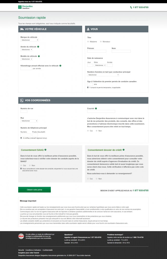
A little heavy for a “Quick Submission”, no? However, and this is paradoxical, but we are much closer to an ideal landing page than the previous page. Already because the attention ratio is perfect (1:1 excluding legal notices and telephone numbers), but also because the consistency is much better: the title talks about Quick Submission, very good point. All that was needed was a little more text, talking about the discount, customer satisfaction, and the benefits that Desjardins could bring me, and that was it. And possibly a slightly lighter form, which could increase the conversion rate.
Note: this is just one example among dozens found after a few minutes of research. Sorry Desjardins, you were just a perfect example.
In a nutshell, consistency is measured by the landing page's ability to reflect the user's clicked call-to-action message. We therefore want to find, on the landing page, the same text or even the same visual as on the ad: we simply want the promise to be kept .
Achieving good consistency is easy. Yes, easy. In the context where we use a dedicated and specific landing page for each objective (so for each ad group in Adwords for example). On the other hand, it is very complicated to obtain a good coherence between advertisement and destination page when the latter is a page of its site.
Why? Because your website, and especially your home page, is dedicated to communicating your USP ( Unique Selling Proposition ). While your landing pages are designed to respond to UCPs ( Unique Campaign Proposition ). Big difference. There is only one USP for your company, however you can have as many UCPs as campaigns in progress. A landing page is therefore not appropriate because you cannot change your title and content to reflect all of your UCPs (this would result in blurry art and a big impact on your USP). Hence the need to dedicate a landing page for each of your campaigns.
4. TO BETTER SEGMENT AND QUALIFY YOUR LEADS AS THEY TAKE ACTION
Unfortunately, it is extremely rare for a visitor who does not know you to become your customer the first time they visit your site (or your landing page ). A typical user will typically go through several phases during their buying journey. It's time to introduce the Buyer's Journey , popularized by Hubspot :
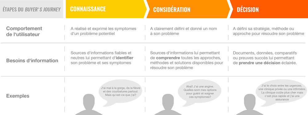
Source: Hubspot
For each phase, the user therefore has different needs: if you serve the same content to all users, or all your content on a single page, you can be sure that it will work poorly for a majority of them .
To respond to the different phases of the Buyer's Journey , you are therefore supposed to design different types of content. It's when it comes time to distribute these pieces of content that designing multiple landing pages becomes important:
- Knowledge = ebook or expert analysis = landing page A
- Consideration = webinar = landing page B
- Decision = comparative or demonstration or free trial = landing page C
Multiplying the landing pages for your content and the different phases allows you first of all to measure your conversion rates more precisely through your funnel, and therefore to identify the content that performs well and the ones that should be reworked.
But if you pair these landing pages with a CRM or marketing automation tool, you'll be able to identify and track users through their journey. And therefore to personalize their experience as much as possible.
By placing tracking pixels on all your landing pages, you will be able to know their behavior, assess their interest and implement actions based on this data. Even automate these actions ! Let's imagine a concrete case:
“Driven by my good resolutions from the start of the year, I'm looking to take up a new sport during the winter. On Google, I search for cardio sports ideas.
The AdvisoFitness gym, with the Buyer's Journey in mind, has designed tons of content around cardio sports and is ubiquitous in my search results. It's perfect to inform me all this!! From my first visit to their blog, I was “pixelated” by their marketing automation tool, which registered me in its prospect database. He doesn't know anything about me, but he knows I exist.
I love this content I read, and a big call to action catches my eye at the bottom of one article: I'm offered a free 50-page guide, featuring analysis of each sport, with pros & cons of experts! Great! I click, and come across a dedicated landing page that offers me just one thing: exchange my email for this enticing guide. Doesn't sound like much for what I'm going to get, so I comply, then go back to work and make a note to check out this guide tonight when I get home. For its part, the marketing automation tool has recorded my email and is preparing to use it...
But not right now. For now, I'm reading. And after a few days, I decided to start Crossfit. It seems to be fashionable. So I go back to Google and, since I don't want to be wrong, I type "best crossfit class in montreal", looking for advice. Ah, it looks like AdvisoFitness, in addition to writing articles, is also running an Adwords campaign: they're there, in the first place of the results, enticing me with an ad headlined "Crossfit course no1 in Mtl according to its members". It arouses my curiosity, I click… On the landing page , I am offered to download a comparison of the main courses in Montreal, evaluated by 3 independent bloggers. No info to give in exchange, I download.
In the background, the marketing automation tool registers all this behavior and my “score” starts to climb: I become an interesting prospect and fall into the “crossfit-hot” segment of the tool. It's time for them to draw the third stage of their rocket: email.
Because the next day, I just received an email inviting me to a free Crossfit class. The offer falls too well! I click and land on a new landing page inviting me to book my free lesson in exchange for some additional information about me: name, first name, phone, etc. I gladly leave them and register. Obviously, the marketing automation tool still records all that, my profile is getting more and more complete and my score is skyrocketing, I'm becoming a really hot prospect.
The following Monday, the first Crossfit class of my life. I'm in pain, but the teacher is dynamic and the atmosphere is excellent, I'm won over. At the end of the course, Camille, “hostess” at AdvisoFitness and who knows EVERYTHING I've done during my online journey, only has to remove my last objection (“it's expensive!”) by offering me a special offer for my first subscription. Everything is there, I sign.
And this is where marketing stops to make way for the customer experience…”
So yes, it's obviously an ideal world and it's much easier to write than to do. Yes, it takes a lot of effort to put such a comprehensive strategy in place. But it's perfectly possible, and it doesn't require huge budgets.
And above all, this little simplified example serves to show the central place of landing pages in identifying users during their purchase journey, then allowing them to be segmented using appropriate tools, thus better personalizing our communications with them. and qualify them more finely. With the ultimate benefit of increasing your conversions, and therefore your sales.
When you see all that simple pages can bring as benefits, it would still be a shame to miss it, right?
%20(1).jpg)


