After the study of the redesign of the home page, I am interested today in the list of concerts.
In the old version, choosing a concert based on an artist or a concert hall was very easy. Presenting the shows in a table format made reading the information quick and easy, without requiring too much vertical scrolling.
In addition, it was also easy to filter the shows by type of music or to choose to see the list for another day, since the menus allowing it were located on the left of the screen. (See below)
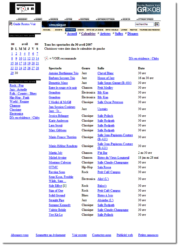
Old interface of the concert list of www.voir.ca
On the new version (see below) the shows have been grouped in a single column, each line of which contains the name of the show, the place, the date and the type of music. The amount of white space has decreased compared to the previous version which does not make it easier to read.
To compensate, different colors have been used for the information but this only adds an additional disruptive element. In addition, this presentation lengthens the page a lot and, on days with a lot of shows, the amount of scrolling becomes detrimental.
The calendar also lost usability on the new version. Rather than being presented directly in the left column where users instinctively saw how to use it, it is hidden below the menu at the top of the page.
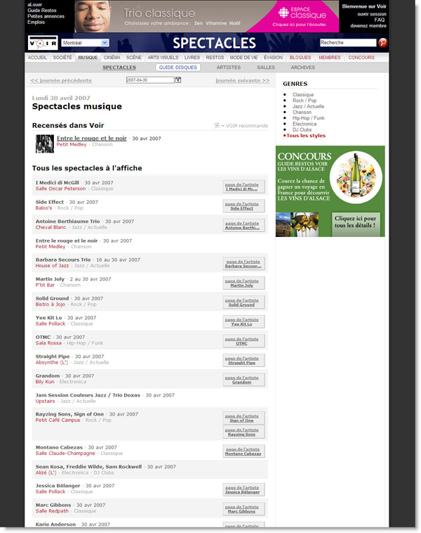
New interface for the www.voir.ca concert list
These choices were apparently made to allow an extra box to be added to the right of each result (below). This box contains a link to the article page and when available a photo. The purpose of this link is apparently to direct users to a section requiring registration. This seems very superfluous to me, on the one hand because it is not very useful for users whose goal is to find an artist they already know and on the other hand because the presence of a photo further weighs down the presentation of the shows. In addition, users are not encouraged to register because they are never presented with the potential advantages.

On the right the link to the artist's page.
To conclude, it is true that in terms of image the site of seeing required a certain refreshment. Unfortunately the ergonomics of this new version has really been neglected, which could be harmful to their image. Hopefully future versions take more into account user habits and needs.