New visual identity for Instagram: what do you think?
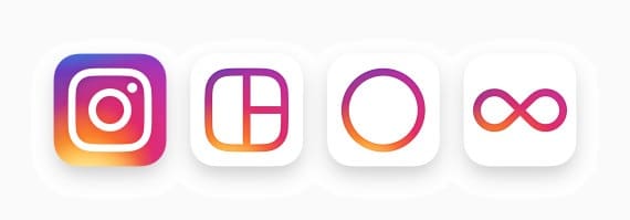
Earlier today, Instagram unveiled its most recent update to the general public. The social network dedicated to photo sharing has abandoned its classic logo in favor of a more lively icon and has declined it at the same time for its related applications Boomerang, Hyperlapse and Layout. On the new logo, we still find the Polaroid and a rainbow, reminiscent of the old logo. The result is definitely more refined and minimalist.

Source: Instagram.com
According to Instagram, "The Instagram community has evolved over the past five years from a place to share filtered photos to so much more: today it's a global community with diverse interests that shares more than 80 million photos. and videos daily. This new look reflects just how rich and varied storytelling has become on Instagram. Inspired by the old icon, this streamlined shape represents a more scalable camera with the rainbow coming to life in its gradient version. »
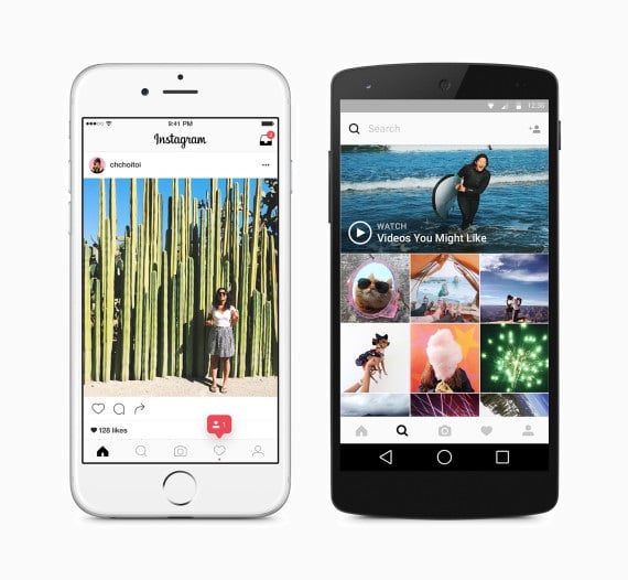
The application, bought for 1 billion dollars (USD) by Facebook four years ago, has also redesigned its interface. The blue banner at the top of the application has now disappeared to make way for the sober black and white, discreetly integrated to leave the foreground to the colorful photos and videos of the community. Fonts are also standardized in the update for iOS and Android.

Source: Instagram.com
Barely announced, the most important update of the application to date leaves no one indifferent. On our side at Adviso, the reactions are polarized. Some see it as a continuation of the old logo or a refreshing change, others advocate #resistancetochange. One employee even questions the creative process behind the new design:

We remember that the application had raised the dissatisfaction of users following the announcement of the change in its algorithm a few months ago. And you, what do you think of this new, much simplified visual identity?

.jpg)

-Sep-07-2022-08-25-30-70-AM.png)


