


We are working to update this article to provide you with the most recent information. In the meantime, please note that some data may no longer be current.
In today’s digital world, just about every action leaves a trace. This fact has radically changed the basic dilemma of marketing analysis: in the past, we had small amounts of imprecise data, while today the deluge of structured information accessible through the most well-known analytics tools has changed the playing field. The mantra is no longer that we’re working with a dearth of data, but rather that we require a level of organization that enables us to understand the data and put it in context.
The accuracy of advertising measurement has thus increased , not only thanks to the development of platforms and the volume of data available, but also thanks to the measurement structure and standards that have been adopted around this data. Thus, the task is relatively simple when the key performance indicators (KPIs) are measurable with precision via your data system, for example a number of transactions to be achieved, or an average basket value to be maintained. But what if these KPIs are not directly measurable via your platform? How to measure brand recognition or feelings about it? You will find below elements that can guide your reflection in order to measure the effectiveness of your brand campaigns.
FIRST STEP: DETERMINE YOUR METHODOLOGY
As in any good analysis, the first step is to define your methodology, and quote it clearly and precisely in your conclusion report. Several elements must be taken into account.
CHOOSE YOUR DATA SOURCES
Although a lot of data is available, you must verify the integrity and validate the official list of data sources that you will use during your analysis. Pay attention to the scope of data used: if you only use Google Analytics, your data will be limited to your site only. If you want to know the behavior of your users beyond this framework, you will have to go to other tools, such as the statistics of your Facebook page for example.
Most of the time, analyzes are done with Google Analytics (last click! see below for more details), but if they are available, try to broaden your analysis to all the relevant data sources at your disposal:
- Social statistics of your Facebook page or ads: all social indicators of the platform such as likes, fans, shares, comments, etc.
- Statistics of your Search and Display networks: search intentions, impressions and clicks on your branded keywords, etc.
These platforms are full of very precise data (impressions, clicks, etc.). But why limit yourself to quantitative data? Polls like Google surveys allow you to directly ask relevant questions directly to your users.
ESTABLISH THE METRICS AND DIMENSIONS ON WHICH YOUR ANALYSIS WILL BE BASED
After having inventoried these sources of data, it will be necessary to choose the indicators which you will analyze. Google offers a very good model with the tools of its suite here:
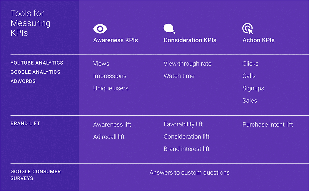
We observe here the methodology used which links the indicators to the user's purchasing cycle: First contact (awareness, the user is aware that your brand exists), consideration (the user links his needs to your brand) then action (conversion). The analyst's task here is therefore to recreate the user journey and attach the KPIs that best measure each step.
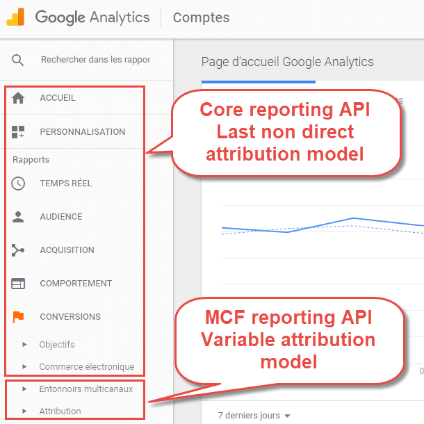
Finally, don't forget to use Google Analytics cross-channel reports. Most of the time, analyzes are done with the Core Reporting API, which covers the majority of reports. The MCF API lets you assign a value to every touchpoint in the user journey, not just the last one. Also pay attention to the logic of this API, it only works with conversions (objectives and transactions), and not the “classic” indicators of the Core Reporting API (sessions, user page views, etc.).
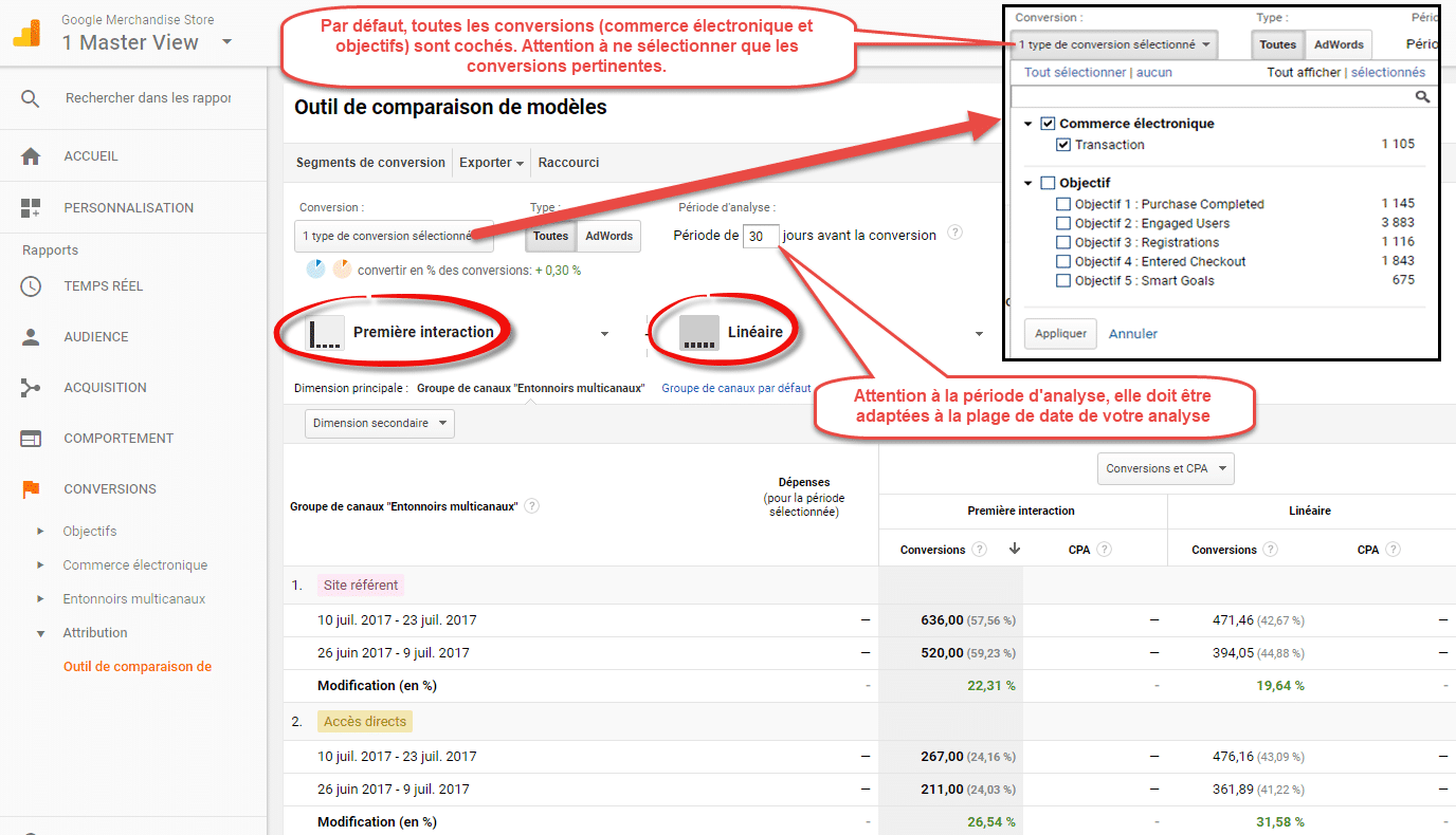
Given that awareness campaigns aim to create awareness and not to convert, an analysis with a "first click" attribution model or a linear model will be much more relevant in this situation than the "last non direct" model used. in most Google Analytics reports .
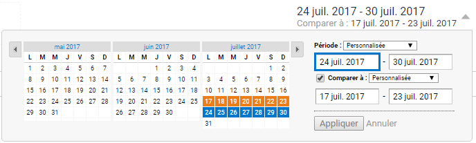
DETERMINE DATE RANGES
Then be careful to determine the date ranges, because they must be comparable. Moreover, if your data export is not automated, a range error will make you start work again “for nothing”. Here are some criteria to consider when determining them:
- Equal duration between tracks. Note that this criterion is not mandatory in the sense that you can also make averages to compare date ranges of unequal duration.
- Number of weekend days present in the analysis, which can impact the results.
- Site seasonality: the end of December and the first of January are always lower for a majority of sites, but also depending on your industry: RRSP period for personal finance sites, or November December before the holiday season. year for an e-commerce site.
- Integrity of the measurement system: was it consistent and reliable over both periods?
- Does your site have enough traffic for an honest week-to-week comparison? If this is not the case, the method of average per day / week / two weeks / month is possible.
SECOND STEP: EXTRACTION AND ANALYSIS OF THE FIGURES
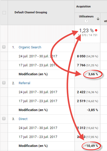
The first step is to compare the evolution of the contribution of the channels concerned (organic and direct) to overall traffic, both in volume (from 800 to 1,000 sessions, i.e. +200 sessions) and in contribution (from 5 to 10%, or 5 percentage points increase). This analysis is available directly in most platforms, such as here in Google Analytics.
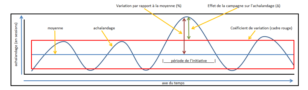
Then, we can push the analysis further. Trend analysis will give you the rate of change between the two periods. But is this rate significant? Indeed, your traffic naturally experiences positive and negative variations. In other words, if your traffic has varied, has it varied more than usual? This is what we will measure with the calculation of the coefficient of variation:
The three pieces of data needed to assess this are:
- The average: average value of the series of numbers
- The standard deviation: measure of dispersion of the series of numbers
- The coefficient of variation: standard deviation divided by the average, which gives the average variation of the series of numbers
Easy to calculate with a spreadsheet like Google Sheet or Excel, here’s an example of a calculation of the variation coefficient:
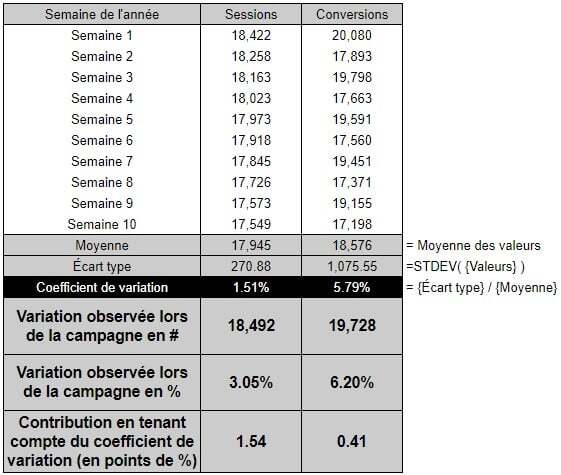
You’ll then be able to compare your variation by subtracting the variation coefficient. Then you’ll see that just because the variation of the indicator is higher during the campaign, it doesn’t mean that it has a greater impact: although conversions increased more than sessions, the campaign made more of a difference in terms of reach than conversions.
Consider varying your data sources! The majority of users use only Google Analytics for these types of exercises, but other sources can be gold mines for this type of analysis. Among others, survey tools are easier to implement than ever. They put you in direct conversation with your users – not something you’ll want to miss out on.
Happy analyzing!