When flat design harms ergonomics
From 18 months, my son was able to unlock my iPhone by sliding his finger on the screen. And he wasn't the only one. But that was at the time of iOS 6. Since iOS 7, my 2 year old little boy can no longer unlock it, despite the fact that the movement to reproduce has not changed, a movement that he had succeeded in dozens of times. Why? It is the lack of affordance that is in question here, a quality that is rather rare in interfaces that have adopted a "flat" design.
 Les
Les
“FLAT DESIGN”: A DEFINITION
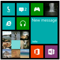
Flat design could be defined as a design philosophy that favors the absence of style elements such as outlines, shading, gradients or optical reflection. The flat design is therefore minimalist. A good example is the Windows 8 interface.
Quite the opposite, we find the trend of skeumorphism, that is to say an interface that echoes the real world, for example the "Compass" application included with iO6 (Apple).

"Compass" application included with iO6 (left) where we can notice the faux wood, reflection of light on golden and rounded metal. On the right, the iOS 7 application, the design remains skeumorphic because it takes up the concept of a mechanical compass, while the design
THE MAIN PITCH OF FLAT DESIGN: THE LACK OF AFFORDANCE
We don’t need drop-shadows to encourage us to poke at something. All we need is an invitation, in the form of icons or labels or animations which imply functionality, and a consistency of presentation which allows us to make a good guess about what we can interact with.
Matt Gemmell
Affordance is “the ability of a system or product to suggest its own use”. For example, in the main menu on the Apple.com site, the chosen menu item looks depressed.
![]()
Affordance can be obtained by employing visual clues which, by analogy with the real world, allow us to guess the elements with which we can interact and the probable result of this interaction. In this sense, skeumorphism can increase the affordance of an interface. A good example is the unlock interface offered on iOS versions 1 to 6, which illustrates a button that slides into a cavity (below). This design, skeumorphic, was clearly more ergonomic than that proposed in iOS7.

Unlock interface on iO6.
But skeumorphism can also harm affordance. For example, in the podcasting application in iO6, the reels of magnetic tape take up a lot of space without it being possible to interact with them, next to buttons which are functional (below).
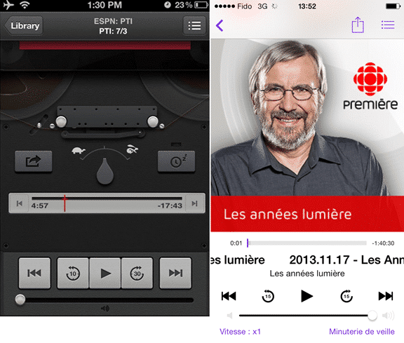
Podcast player on iOS 6 (left); and on iOS 7 (right)
ON THE WEB
Good affordance can also be achieved by following conventions. For example, a down arrow next to a label usually means that an area will appear directly below, on the same page. While an arrow to the right generally means that we would be redirected to a different page. From an ergonomic point of view, it would be risky not to follow this convention.

HYPERTEXT LINKS, A FEW PRINCIPLES TO CREATE AN AFFORDING DESIGN
Hypertext links are the very essence of the Web. This is why they must be given great attention during graphic design.
A hyperlink should look clickable. And conversely, non-clickable elements should not look clickable. Indeed, if the user starts to click on elements that do not allow interaction, a loss of confidence will set in, and the user could be tempted to avoid the site in the future or to limit its use.
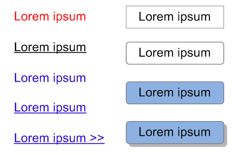
The affordance of the above links is uneven.
The affordance, however, depends on the context. For example, the Internet user knows intuitively that the labels placed in a header are links, because of their location. It is therefore not necessary that the color chosen for the links be used in all cases. Also, some links must be more discreet, either to guide the user towards the recommended action, or to avoid distracting him with secondary functionalities.
BLUE
Blue is traditionally associated with hypertext links, as it has been the default color for links since the very first web browser in 1992. Therefore, due to the habit of Internet users, it is rather risky to use blue for anything other than clickable elements.
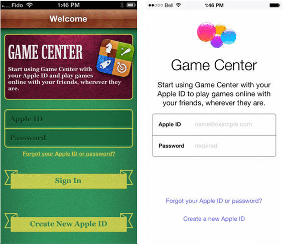
iOS7 (here on the right), uses a single color per application to represent clickable elements, most of the time blue.
Find a recognizable style
Blue is obviously not the only option available for hypertext links. It's more about being consistent, finding a recognizable style. For example, we could use underline or another color.
ERGONOMIC DESIGN TIP: USE A NEW COLOR TO EMPHASIZE NON-CLICKABLE ELEMENTS
To create a visual hierarchy that can guide the user's eye, a good approach is to use a new color, separate from the color of the clickable elements.
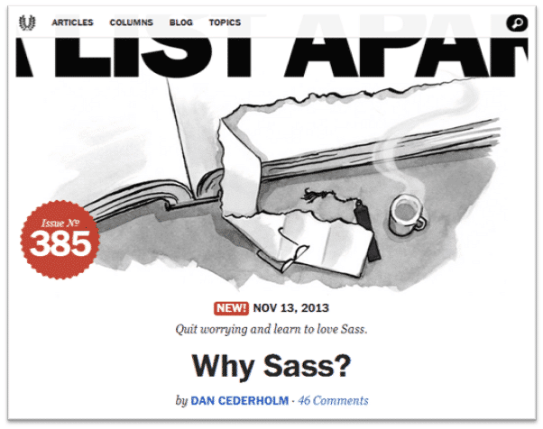
The A List Apart site uses this technique in a beautiful way: blue has been chosen for the links, while red is used for the subtitles, the pellets (new, number) and a few other non-clickable elements.
WHY NOW
Why is minimalism design trendy? The most credible hypothesis is that in the context of creating an adaptive design, minimalism harmonizes better with the different operating systems (iOS, Android, Windows 8) that exist on the market.
GOING FURTHER: REVISING THE INTERFACE FROM THE BEGINNING
Moving away from a design that takes up the characteristics of real objects is a legitimate goal, but it is more difficult to do than it seems. The risk of giving birth to a design that is not very ergonomic is relatively high.
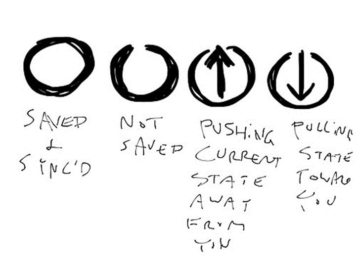
For example, we have been talking for a while about replacing the famous floppy disk icon to represent file backup, the floppy disk being an object that many users have not known. Many proposals have been made, among other things to try to adapt to cloud backup, but none has been imposed so far.
That said, nothing prevents you from reviewing everything from the beginning. I am thinking for example of the Soulver application, which does everything a calculator can do, but allows the use of natural language.
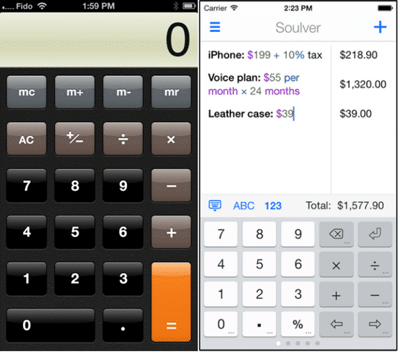
By moving away from the calculator analogy, the designers of Soulver had the opportunity to create a calculator that was not only more powerful, but easier to use. For example, in Soulver, one can see and correct an error easily.
LONG LIVE MINIMALISM, LONG LIVE ERGONOMICS!
I am personally a fan of minimalism. However, minimalism represents a real challenge on the Web, because it is necessary to avoid increasing the mental load of the Internet user. In other words, the user is telling us, "Don't make me think. This is why the expertise of an ergonomist will be needed more than ever to meet the challenge of creating minimalist designs that offer good affordance.


