Design an ergonomic homepage
The homepage is usually the most visited page of a website. It is often the first page that we consult and if this is not the case, we generally return quickly to the home page to explore a site. Much like a storefront, the homepage gives a first impression of your site and directs the potential buyer. Here are the basics of a well-built landing page that respects conventions.
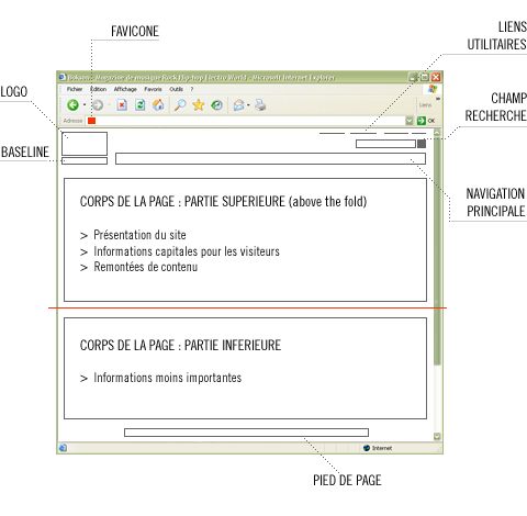
The goals of a good homepage are to establish the foundation for site navigation (to direct it to the user's goal) as well as to educate the user about the content that is in the site. A good page should also encourage people to discover the site. Here is a functional mockup with the most common elements of a homepage with the location to respect.
(image from ergo lab)
- Favicone: Small logo in the address bar that identifies the site in browser tabs as well as in bookmarks.
- Logo: The logo is one of the most viewed elements by new visitors to your site. The user's eyes begin to roam the site in the upper left corner. To reinforce the site's brand, it is therefore recommended to place the site's logo there.
- Baseline: Half-slogan & half-theme, this element should give the visitor some idea of the purpose of the site. The less the site is known, the more important this element is as a landmark.
- Utility links: Allows the user to perform specific tasks such as finding the contact section, connecting to a secure area, changing the language, the sitemap, etc.
- Search: The location of the search engine varies from site to site depending on the type of site. It should be easily identifiable and placed at the top of the site.
- Main menu: The main menu is generally at the top of the site, but sometimes also on the left for sites with fewer pages.
- Body of the page: This section varies from site to site. We recommend placing the priority content above the fold, the page should not be overloaded and it is preferable to limit the number of columns to 3.
- Footer: The bottom of the page should not be overlooked. We usually repeat the navigation of the site. You can also include a link to return to the top of the page. The links to the terms of use are also at the bottom of the page.
As a bonus…don’t forget that the site must meet the needs of the customer above all!


.jpg)


