2015: Has Google made this the year of mobile?
Have you ever noticed the words " mobile friendly" or "mobile site" in the search results pages on Google when you search on your smartphone?
As of April 21, these will likely be the only results displayed, as Google has announced a change in the algorithm for mobile results.
WHAT DOES IT MEAN?
If your site is not optimized for mobiles, it will be less well positioned or even absent from the results of searches carried out on mobile. In other words: no mobile version of a site, no results on Google mobile, less traffic from Google on your site, fewer conversions!
WHY THIS CHANGE?
Have you ever come across a site that is not mobile optimized while on your mobile device? Did you have to pinch your screen to zoom in and out? Pressed the wrong button because it was too small? These constraints are a sign of an inadequate user experience.
Google is constantly improving its user experience with small or large algorithm changes, for example to return more relevant search results according to user intentions.
IT'S A W IN-WIN FOR GOOGLE AND THE USER, BUT WHAT ABOUT SITE OWNERS?
Those who have jumped on the responsive or adaptive design bandwagon for their latest redesign are already well prepared. Those who have an m.domain.com version should also be fine except for those who have only transformed certain pages or sections of the site into mobile, which we see quite regularly. In this case, it is only the pages on m.domain.com that will be put forward by Google on the phones. However, you should know that Google encourages responsive design to the detriment of other methods.
The impact will be nil for desktop searches , but as we mentioned a few weeks ago, mobile searches are growing strongly, even in Canada. This algorithm change will be major, as announced by Zineb Ait Bahajji from the Webmaster Trends team last March:
Google did say when they announced the mobile-friendly ranking algorithm that this would have a “significant impact” on the mobile search results. This is key, it is only impacting the mobile results and even so, it will have more of an impact than Panda or Penguin. Source
HOW DO YOU KNOW IF YOU ARE READY?
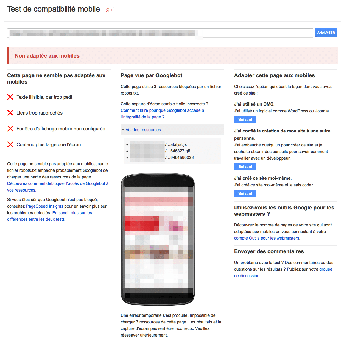
Google offers a tool for developers to validate the pages of a site and know if their design is optimized for mobiles: the Mobile compatibility test . Be sure to validate your site's important templates, conversions pages, product pages, section pages, high-performing articles, etc. Here is an example of a page not optimized for mobile:

You can also quickly see in Google Mobile search results if your site is listed as mobile site , which is a possible change as of April 21. If several of your site's results don't show this, you should be concerned.
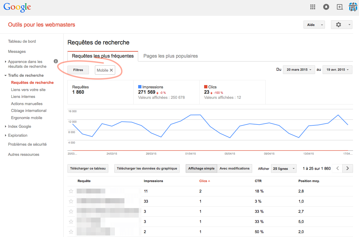
You can also see, through Google Webmaster Tools in the Search Traffic > Search Queries menu , the traffic you are currently receiving from mobile searches in order to assess which impressions and clicks are at risk. If there is already a big variation between your rankings on desktop vs mobile, Google is already penalizing these pages – it will be important to take a close look at this this week.

A more advanced tool allows to evaluate the mobile experience in a granular way, directly through the Mobile Emulation Tool function of the Google Chrome browser . This video , created by Annie Cushing , explains in detail how to use this tool as part of an analysis of your pages.
OTHER POINTS TO CHECK
- Make sure your robots.txt file doesn't block Google's access to your mobile pages and JavaScript and CSS files.
- Check the download speed of your mobile pages, as this has an impact on positioning. You can use the PageSpeed Tool for this , Google's tool for developers.
WHAT IF IMPORTANT PAGES AREN'T OPTIMIZED FOR MOBILE?
If you don't have a mobile site at all, now is a good time to think about it!
If you have a mobile site, speak quickly with your agency and/or your front-end development and usability teams to perform a mobile audit and implement fixes to templates or pages that are not optimal.
- Touch elements too close: buttons or fields are not far enough apart, making them impractical with a touch screen
- Viewport not configured: Viewport does not update to screen size by displaying as a shrunken version of the desktop version
- Small font size: font does not update with screen size, making it unreadable unless zoomed in
TL;DR
If you don't have a site with important pages optimized for mobile, your visibility on Google will be diminished. In addition, expect other changes in this direction this year… Think about optimizing your container as well as your digital content so that they are mobile-first and take into account the user experience.


