


Stay focused on your goals
Une intro sur la page succès clients. Garder ça court. Lorem ipsum dolor sit amet consectetur. Accumsan accumsan in bibendum auctor consectetur. Tincidunt mauris proin amet donec lacinia bibendum sed sit mi. Vestibulum tellus auctor pellentesque sed vel lobortis sagittis. Enim ornare fringilla amet vivamus eu.

Is your loyalty program measuring the right KPIs?
After spending 30 years in loyalty, I’ve made a worrying observation: Loyalty programs are often man …

8 mistakes your mobile application should avoid
Is your mobile application a growth lever... or an expensive technology silo?
The New Rules of Retail in the Age of AI
We recently attended eTail Toronto, a leading North American retail conference that brings together …

AI agent orchestration: Your AI tools need a manager too
Artificial intelligence is disrupting marketing.

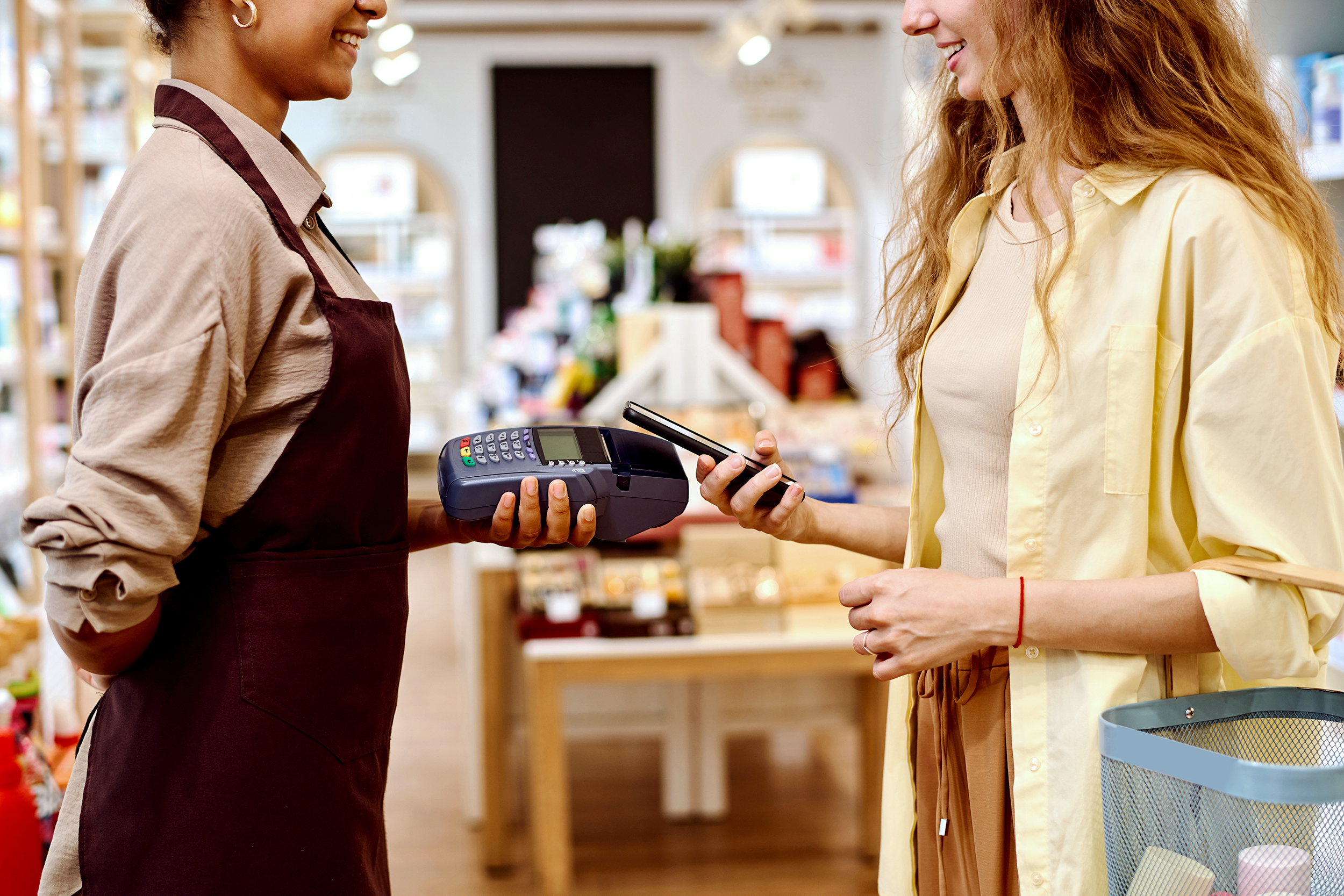
Loyalty programs: How to choose the best martech platform?
Martech for loyalty programs is like an invisible spinal column. It's impossible to operationalize a …

Why integrate gamification into a loyalty program?
Steps for integrationCanadians are increasingly participating in gamification activities within loya …

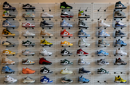
Top 10 best loyalty programs in Canada
Technology is evolving, as are consumer expectations. That means loyalty programs are changing too.

Meta Andromeda: An AI revolution in paid social?
Meta Andromeda is being presented as a radical turning point in advertising performance on Meta plat …

How artificial intelligence is transforming customer experience (CX)
For a long time, artificial intelligence (AI) was perceived as a futuristic vision. Today, AI is no …

Your next step: Adobe Customer Journey Analytics
Do you already use Google Analytics 4 but find that your analytics questions are becoming increasing …

Uncertain times: How can (and must) B2C brands adapt?
In recent months, the political climate has shifted the concerns of Canadians from “The cost of groc …

With AI controlling Google Ads, what if marketers lose their expertise?
Inspired by Digital Marketing in an AI World by Frederick Vallaeys

The era of AI and instant answers: How to reposition your brand to exist without clicks
Search behaviours are changing fast. With the rise of ChatGPT, Gemini, Copilot, and the answers prod …
The two aspects of loyalty program performance
Most articles and discussions on the topic of loyalty programs are essentially about their design. P …
Shopify e-Commerce Tracking: Solutions for 2025
Since April 2025, Shopify has been changing the game when it comes to e-commerce tracking. Tradition …

4 MarTech trends that are redefining the future of marketing
As the digital transformation speeds up, marketing technologies (MarTech) are evolving at an unprece …

Content Security Policy (CSP): Is your web security blocking your data?
Today, content security policies (or CSPs) are considered indispensable to protecting your websites …

The fall of the Bay: What retailers should learn from it
The announced closure of Hudson’s Bay stores marks the end of an era for arguably the most emblemati …

8 trends in loyalty in 2025
Given that over 19 loyalty programs have a presence in Canadians’ wallets1, which represents signifi …

AI agents: The future of productivity starts now
The heightened interest in generative artificial intelligence (AI), specifically in AI agents and la …

Sustainable media strategy: Combining performance with environmental responsibility
Because they are energy intensive, media play a key role in the fight against climate change. The go …

Artificial Intelligence (AI): Solutions for Ethical and Sustainable Use
Artificial intelligence (AI) has become an essential component of many human activities, transformin …

The top 10 best loyalty programs in Canada in 2024
This past fall, R3 Marketing and Adviso, in collaboration with Ad hoc Research, unveiled the 7th edi …

Will Search GPT replace Google? What you should do to stay on top of the situation
The short answer: Search GPT will not be replacing Google in the near future, but it will redefine o …
Find and leverage what really matters.
Get our insights and recommendations to stay ahead in the marketing landscape.