Executive IT Advisor and Privacy Officer
Managing an online catalog well: can we do without a “Products” section?
Executive IT Advisor and Privacy Officer
A large number of companies that want to offer their products or services online provide their site with a “products”, “services” or “catalogue” section. It seems logical, of course.
Yet most of the time, I believe this logic is flawed. Not so much to have an online catalog, as to have a catalog section .
This situation is particularly common in sites offering both products and something else – for example services, advice, documents, or online tools. In these cases, creating a separate catalog from the rest of the site helps isolate products from other content, but is it really a good idea?
In most cases, if the business model of the company is to sell products or services, the site itself, almost in its entirety, should be a catalog… enriched with other functionalities .
While most e-commerce platforms are directly built to feature all major product categories in a recurring menu (so on all pages, right from the homepage), other types of systems ( CMS, CXM and other frameworks ) give much more freedom to site designers… who often create a catalog within a site .
BLAME IT ON THE WEB STRATEGY AND THE CONCEPTUAL MODEL?
For any site that has undergone proper strategic web planning, certain tactics have probably already been prioritized: the site must present products, advice, the company, etc. Too often, when it comes time to translate these tactics into a site, these priority elements become sections.
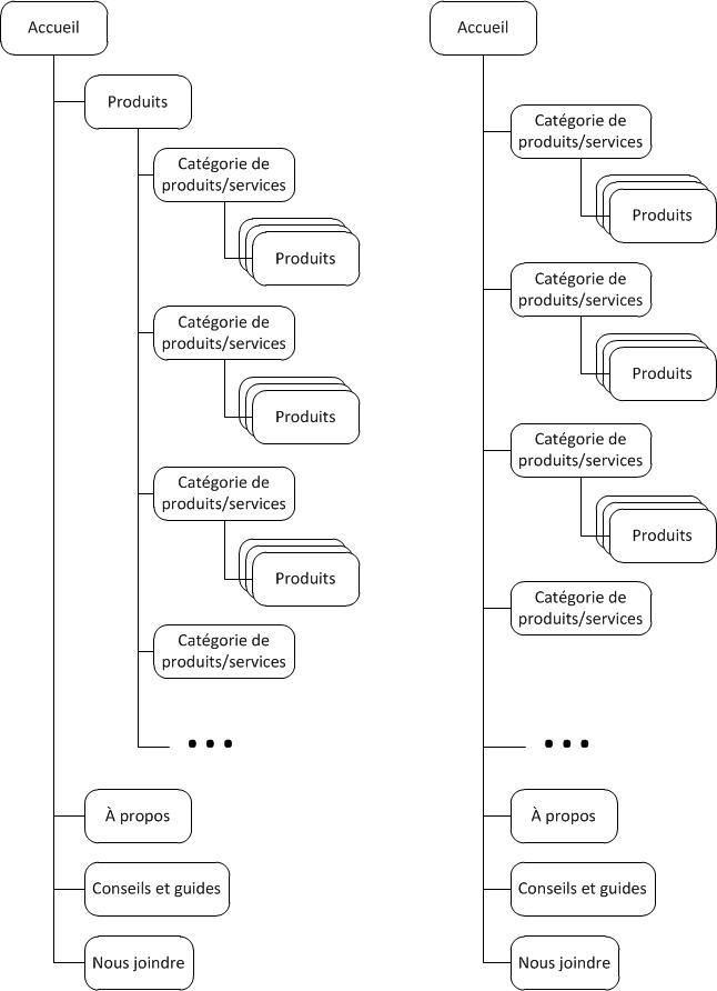
How to avoid falling into the trap? Remember that individual products and product categories are more important…than the catalog , which is just one way to showcase them. After all, most of the time, customers want products. These should therefore be presented directly rather than being hidden in a dedicated section.
BLAME IT ON THE INFORMATION ARCHITECTURE (OR THE TREE STRUCTURE)?
Usually, the design of a site includes a stage where we define what will be the relationship between the pages (or sections, or page templates) of the site, and what type(s) of navigation there will be between these pages.
In this situation, usability principles taken too literally still sometimes add a “products” section which is not always desirable:
- A menu must include a maximum of 7 +/- 2 items
- All site content must be accessible to a maximum of 3 clicks
- Simplicity is always better
- Too many elements at the first level of the tree structure will result in a clunky or messy looking site
In the end, even if these principles start from good intentions, approaching them in a dogmatic way can cause harm when it comes time to highlight the products or services of a company.

It's like an architect designing a space based on the aesthetics of the plan itself…not on having a finished building that is pleasing to its visitors.
WHY A CATALOG WITHOUT A CATALOG?
There are many reasons to provide access to the products of a site without isolating them in a dedicated catalog section:
EXPRESS YOUR SPECIALTIES CLEARLY
By directly naming the products or product categories in a persistent menu, the specialty of the company and the raison d'être of the site are more obvious and allow you to quickly understand who you are dealing with... whereas a menu that begins by “Products”, it's pretty generic.
The same goes for the main disciplines of a service company: listing them helps to be less abstract , especially when the company is less known or when the business area is difficult to pin down.
FIRST, MEET VISITOR EXPECTATIONS
In most industries, many visitors come to a company's site with a product in mind, and will be satisfied faster if they see what they are looking for directly, or something like it...so it's imperative to use search trends in planning the site and to test whether the user will easily find what he is looking for ; by listing categories or products directly in the menu, we also give a helping hand to destiny:
DEMONSTRATE THE VASTNESS OF THE OFFER
Anyone who's ever worked with me on a redesign project knows that's one of my favorite phrases. Indeed, this is an important goal of most business sites. On the other hand, the presence of a catalog only guarantees access to products and services… and not their promotion.
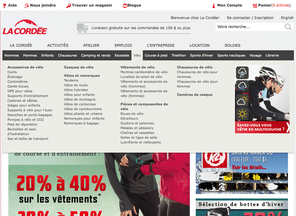
By naming product categories directly in a persistent main menu and on the home page, we maximize their chances of being seen by potential customers (our client La Cordée uses this kind of persistent menu accompanied by drop-down sub-menus) :

KEYWORDS AND INTERNAL LINKS, IT DOES NOT HURT
The internal linking structure of a site has an influence on the quality of its search engine rankings, and it is often recognized that the fact that a page is easily accessible from the home increases its chances of being indexed as an important page of the site .
Even though there are tons of other ways to include internal links with the right anchor texts to a site's main products, why not take a systematic approach and list the most important categories or products in a persistent menu?
Either way, your ability and interest in positioning yourself for such a vague word as “Products” and “Catalog” is pretty much nil.
Keep in mind, however, that there is a limit to the number of links that will be followed on a page, and if you include an extremely detailed menu (read: containing hundreds of links) at the top of each page, you should ensure that you do not harm your internal linking strategy.
COMBINE ADVICE WITH PRODUCTS
When a site contains content for advice, inspiration, comparison, selectors or even search tools, these have a very important role in selling, even if they are not catalog pages. strictly speaking.
Unfortunately, too many sites separate this content from the catalog by isolating it in sections that are hard to notice when shopping on the site. Worse, the advice page for a specific product category is not systematically linked to this category in the catalog.
Why not include these contents directly in the product catalog, near the offer they serve?
OTHER SUBTLETIES
To implement this approach gracefully, a few nuances could be considered:
CHEATING BY PRE-OPENING THE CATALOG
Sometimes the approach that makes the most ergonomic sense is to demonstrate that there are sections at the same level as the product catalog.
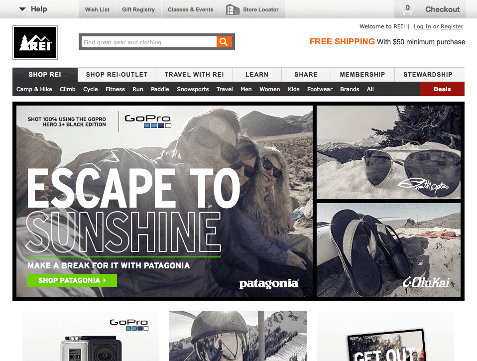
In this case, nothing prevents loading the home page as if it were the “Catalog” section, by pre-selecting this “page” (non-existent) in the navigation, as the store does in REI line :

SEE ALL PRODUCTS
In some cases, it remains relevant to have a page that lists all the products (or product categories) of a site, even if it is preferable to refer directly to products or categories when possible.
For example, the home page of some mobile sites (or adaptive site displayed on a narrower screen) cannot afford to list all product categories, and it is better to include only an “All products” link. . (In the same way, for obvious reasons, the menu of a mobile site is always accessible via its icon or the word “Menu” , without however being “persistent” as such.)


.jpg)


