“Adaptive” or “responsive” layout: advantages and disadvantages
More and more people are visiting your site from a mobile device. At the same time, screen sizes are increasingly varied. One of the ways to meet these new needs is to create a so-called "responsive" or "responsive" layout.
(Most of these concepts are so new that the terminology in English is not yet decided, while the official terminology in French is non-existent)

INGREDIENTS
An adaptive or responsive layout is made up of three parts:
- a flexible grid
- elements adapted to the size of the screen
- and the use of media queries
A FLEXIBLE GRID
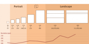
As discussed earlier by my colleague Mathieu, a flexible grid allows a site's content to be presented in an appropriate number of columns, depending on the width of the screen.
We then speak of a folding grid, an adaptive grid.
One of the most obvious adaptations is to reposition the content blocks according to the width of the device, and its orientation (portrait or landscape).
- a column on a phone,
- two or three columns on an iPad,
- four columns on a desktop computer.
This repositioning must then follow certain rules, which an ergonomist must determine in advance. For example, we can determine that the content of the right column must appear at the bottom of the main content, with the footer. Some elements, for example advertisements or labels, could disappear from the page.
ELEMENTS ADAPTED TO SCREEN SIZE
The font size can also be resized, as well as the spacing between blocks.
Finally, images can be virtually cropped, or even replaced by a smaller one.
THE USE OF MEDIA QUERIES
Using "media queries" enables different styles, depending on certain parameters such as screen width or screen orientation.
For the curious, here's what a media query looks like:
@media screen and (min-width: 800px) and (max-width: 1200px) |
Avantages
ALLOWS TO HAVE A SINGLE URL FOR EACH OF THE PAGES OF A SITE
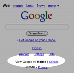
A universal URL for each of the pages avoids having to provide a mechanism to switch from the mobile version to the full version and vice versa, which is not without posing ergonomic problems.
In addition, redirecting the user to the mobile version, which sometimes causes problems, is thus avoided.
ADAPTS TO THE SCREEN OF A MAXIMUM OF DEVICES
A mobile site is not appropriate for an iPad for example. Also, a flexible layout allows for the fact that a device can be in portrait or landscape mode.
DISADVANTAGES
SLOWER THAN A DEDICATED MOBILE SITE
This slowness is mainly caused by the fact that it is necessary to include a greater amount of code directly in the page. However, as we know, speed is essential for Internet users.
More complex to create than a mobile site
Programming this kind of adaptation from scratch can be a daunting task. Fortunately, some enthusiasts have created open code libraries that simplify the work of integrators. However, creating a "responsive" site remains complex.
Conclusion
Building a “responsive” or “responsive” site can be a wise investment, especially as mobile device adoption rates are increasing rapidly. But since few developers currently have experience with these emerging techniques, much higher development costs are to be expected.


.jpg)


