10 factors behind the evolution of web ergonomics
It seems that companies are doomed to periodically undertake site redesigns. Frustrating for some, normal for others.
That said, redesigns are sometimes necessary. Sometimes a technological change is necessary. But often, these redesigns have more to do with changing user expectations. You could also say that expectations increase over time.
Here is a list of the (sometimes surprising) factors that have had the most influence on the evolution of web ergonomics.
1- The mouse wheel (Scroll wheel)
Invented in 1995, it became commonplace in the early 2000s. The wheel greatly facilitates scrolling through the pages. The touch pad, for laptops, had the same effect.
Consequence: The pages have become much longer in the last decade. However, research shows that longer web pages are effective.
2- Liquid crystal screens
Liquid crystal displays, the majority since 2007 and ubiquitous now, have led to a marked increase in the average resolution of displays (and a slight increase in pixel density).
Consequences:
- The reference resolution has been increased from 640 pixels wide to 1024 pixels.
- Buttons and text on the web have grown in size.
3- Cognitive invisibility of advertisements (ad blindness)
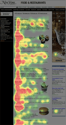
 Eye tracking on a page This term (the French version is my own) refers to the fact that Internet users have stopped paying attention to what looks like advertising. Ergonomists and web designers must take this into account.
A personal experience demonstrated it to me in an eloquent way: some time ago, I was browsing the American Airlines site. I couldn't find some features I needed. Speaking with a representative on the phone, I realized that the features I was looking for were there, but they were located in a menu that looked like AdSense ads. Because of its appearance, this menu had become downright invisible to me.
Consequence: It is better to avoid communicating important information using areas that look like an advertisement. For more, read: "Banner Blindness: Old and New Findings".
4- WordPress and the popularity of blogs
The popularity of blogs has influenced the interface of sites, that is, more and more sites look like blogs. It's probably not strange considering that WordPress, which was initially designed only for blogs, is currently the most widely used content manager in the world.
Consequence: Many sites end up looking like WordPress blogs.
5- The specialization of web artisans
The design of a good site now calls on an army of specialists: strategist, ergonomist, graphic designer, programmer, integrator, etc. But, it wasn't that long ago that programmers were the only web resources in some organizations, and they were frequently called upon to make decisions that were outside their scope.
Consequence: The programmers, left to themselves, made mistakes, ergonomically speaking. One of the most common mistakes is adding a "Reset" button to the bottom of a form. However, even in 2010, it still exists. I spotted one just a few months ago on the city of Montreal website, while paying for a parking ticket online. Sorry.
Evolution of web browsers
Of course, browsers have come a long way since NCSA Mosaic in 1995. At first, it was just text and images on a gray background, with links underlined in blue. And we needed an animated logo to let us know that the request had been sent and that we now had to be patient! (People used to click the same link multiple times, which only made things worse)
The history of web browsers is complex and turbulent. Today, it is above all the World Wide Web Consortium that oversees the evolution of browsers. Originally it was Microsoft and Netscape that competed in terms of innovation.
6-JavaScript
 Standard Alert Window in JavaScriptThis language introduced by Netscape, which has nothing to do with the Java language by the way, was necessary for everything that was to follow. That said, JavaScript took a while to improve the user experience. It is to JavaScript that we owe the unpleasant alerts that suddenly appeared in our browser. On the other hand, it is no longer necessary to go back and forth to the web server to validate the submission of a form, for example.
Consequence: An acceleration of the experience during interactions.
7- Ajax or more precisely XMLHttpRequest
This feature, introduced in Internet Explorer 5, allows refreshing only a region of a page rather than the entire page.
For example, it allows you to validate if a username is already reserved, without refreshing the page. One of the first sites to use it massively was Facebook. It can also be attributed to Google Docs.
Consequences: A sudden acceleration of the experience during interactions.
8-CSS
 Although the standard of the CSS standard is still in the works, cascading style sheets make it possible to completely separate the content of a site and its appearance. Integrators can, for example, create a style sheet for different display contexts, for example for mobile devices or for printing.
Consequences: You can now replace classic dialog boxes (as well as pop-up windows) with visually rich "modal" windows.
9- jQuery
The jQuery JavaScript library makes advanced interaction programming much easier. However, a web integrator often does not have the time to implement the ideal solution from scratch. It must adapt what already exists. Between programming a feature from scratch (hundreds of hours of work) and integrating an existing solution (a few minutes), the choice is clear.
jQuery also makes it easy to share and embed existing plugins. There are almost 3000 of them. A good example would be the free, open-source YoxView plugin, which allows you to create a very high-level photo viewer in minutes.
Consequence: jQuery can easily reduce by 5 or 10 the time needed to add advanced features. This facility has therefore increased the quality of interactions on the sites. As a result, sites that haven't made the switch to jQuery usually look more amateurish.
10 – Google PageRank
For 91% of Internet users (98% for mobile), Google's PageRank ranking algorithm decides your site's position in search results. To optimize the position of a site in Google, it is necessary to adopt certain organic SEO practices that influence the design of sites.
Consequence: For example, it was necessary to abandon the use of images for titles.
Another consequence of this very powerful algorithm is that users land less and less often on the homepage.
Consequence: A user must be able to locate himself quickly when he arrives on a page. It is for this reason that Ariadne's threads have become essential.
Other factors
I could also have talked about Facebook, A/B testing, Google Analytics, operating systems, smartphones, AdWords, Flash. Maybe there will be a sequel...


.jpg)


