Web design: Is this the end of Photoshop? Five facts and four alternate approaches
To try to come up with an answer, I did a survey of some of the issues involved in using Photoshop for web design, and proposed some solutions.
Without further ado, here are five facts about using Photoshop (or any other bitmap image editor) as a graphic design tool for the web.
Effects dreamed up in Photoshop can be tricky, even impossible, to create in HTML
[Photoshop composition] can become sink holes of developer time leading to brittle, buggy code and time misspent on elements of dubious importance
Edward O’Riordan
It’s a classic quandary: Photoshop offers endless possibilities, but the web is limited. It’s easy to forget the constraints of the web while working in Photoshop – and as a result, you can end up with a design that’s too difficult or too expensive to reproduce in CSS (Cascading Style Sheets). Photoshop mock-ups have the additional downside of giving clients unrealistic expectations, leaving them disappointed when the final result isn’t exactly the same as the layout they first saw.
Photoshop is pixel-based, but the web now favours scalable design
To think about the web responsively is to think in proportions, not pixels.
Trent Walton, founder of Paravel
Developers felt helpless […]. They often had to guess measurements in the absence of style guides
In Photoshop, designers work with pixels. But web integrators are now forced to work in percentages or in ems. This means that a layout created in Photoshop gives no precise guidelines to integrators, who are then left to literally guess what typeface the designer had in mind, the dimensions of each element, spacing, etc.
Photoshop mock-ups are often incomplete, especially regarding interactions

Static visual mock-ups often neglect some important questions. For example, what does the button look like on rollover? We end up with these situations because, let’s face it, it’s hard to represent interactivity in static mock-ups.
Comparatively, a style guide has the advantage of being complete, so no details fall between the cracks. For example, a style guide would need to specify the appearance of all headlines (H1, H2, H3, H4, H5), whereas a designer would probably not have the opportunity to illustrate H4 or H5 headlines in their graphic mock-ups.
Editing numerous Photoshop mock-ups is tedious, and can lead to resistance to change
Static visual mock-ups are the currency of the Web but this need to change. We can’t keep creating Photoshop images of the design variations we need to manage
Sarah Parmenter
Keeping all the visual mock-ups for a web project up to date can take a huge amount of effort, so it shouldn’t be surprising that this can lead to a resistance to change – something I’ve witnessed myself on several projects. The end result of this resistance is that the quality of the final product is likely to suffer. In contrast, when you work mainly with a style guide, or directly in CSS, elements only need to be modified once. This maximizes openness to change, since there is no duplication of design artefacts.
Photoshop doesn’t help with the complexity of responsive design
Building a site with responsive design can be very complex, leading many developers to advocate the use of a front-end framework to facilitate the process. That’s what we did for the Adviso site. In this context, you have to ask yourself whether it’s worth it to static mock-up for mobile, when the framework may generate a perfectly acceptable starting point by default.
Thankfully, solutions are starting to emerge…
1. Design directly in a web browser
Throw away Photoshop and be true to your medium à
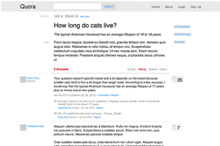
Some people claim that designing a site directly in HTML/CSS is the way to go. It’s a tough position to put into practice though, since few graphic designers have the technical knowledge required to carry this out. Still, Quora was designed this way.
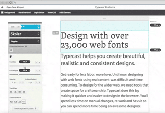
However, tools to allow designers to work in native formats (HTML/CSS) without coding are starting to appear. The most advanced of these is probably TypeCast. This tool lets users create page designs directly in the browser – and with five sources of web fonts plugged directly into the application, the possibilities are endless. Once the design is done, a style guide is automatically generated, as is the Cascading Style Sheet (CSS) for the design.
2. Think of your web style guide as your main design deliverable
Publishing a set of interface elements as a pattern library can help designers and developers collaborate on consistent product experience
Sarah Parmenter
The creation of a web style guide can considerably reduce the need to work in Photoshop; using one means that you don’t necessarily even need page mock-ups. That said, after discussing it with other industry professionals, a consensus has become clear: it’s still useful to create at least two or three static visual mock-ups to give a sense of the look and feel of the site.
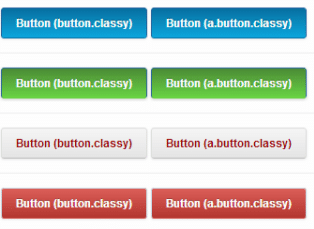
On the upside, working from a style guide can give you more of a global vision of the interface, so you can see whether your elements are coherent. Style guides have other advantages too, for example the fact that they’re generally more comprehensive than graphic models, and that they make the integrators’ work easier by clearly indicating the dimensions, spacing and proportions to follow. There are two kinds of style guides:
- A bitmap style guide
- A CSS style guide
Ultimately, the creation of a CSS style guide is almost unavoidable. Working in a native web format (with a tool like TypeCast, for example), you could skip the bitmap version of the style guide.
3. Style tiles and style prototypes
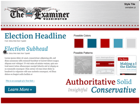
Samantha Warren, a designer at Twitter, likes to start by establishing a visual language for the site, something she refers to as a style tile. It’s kind of a hybrid between a mood board and a style guide.
American agency Spark-box goes even further, offering a new type of deliverable: the style prototype. Similar to the style tile, it’s presented in HTML/CSS, with a responsive layout. The advantage of this method is that it allows you to see your interactivity and typography as it would be seen in a web browser, from very early on.
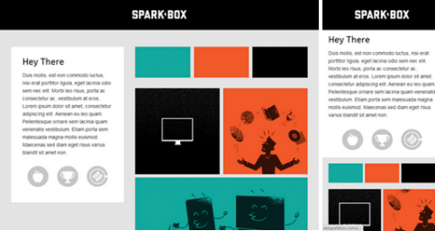
A full style guide could easily be developed from either of these two deliverables.
4. First create a functional prototype, then stylize it
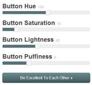
A front-end framework gives you a great base to build a prototype for your website or application. This was the logic behind the creation of Foundation, one of the most popular front-end frameworks out there. Once you’ve created a prototype based on your wireframes, it’s pretty easy for a designer to step in and see what elements need styling. And it’s easy to integrate style into a prototype by adding or modifying some line of codes. Themes and interactive tools have also been developed to modify framework styles.
Conclusion
We probably haven’t seen the last of Photoshop just yet. The freedom it gives us is something I suspect we still need to explore different graphic avenues. Nevertheless, as you’ve seen, the relevance of Photoshop (or any other bitmap editor) for creating page layouts is becoming more and more questionable. Thankfully, some promising solutions are cropping up to respond to the new challenges presented by the web today.
Discussion
- What do you think? Is Photoshop still relevant for your creative process?
- How do you deal with these challenges when you’re creating a site in responsive design?
- Have you tried any of the above techniques? If so, what happened?
- Do you know of any other good solutions, or other tools?


.jpg)
