


A blog that puts things into perspective
Welcome to Perspective, a space for knowledge sharing that goes beyond trends to help you sharpen your strategic thinking and deepen your expertise. Here, our experts share practical perspectives grounded in real-world experience, along with proven techniques ready to be put into action.

Is your loyalty program measuring the right KPIs?
After spending 30 years in loyalty, I’ve made a worrying observation: Loyalty programs are often man …

8 mistakes your mobile application should avoid
Is your mobile application a growth lever... or an expensive technology silo?
The New Rules of Retail in the Age of AI
We recently attended eTail Toronto, a leading North American retail conference that brings together …

AI agent orchestration: Your AI tools need a manager too
Artificial intelligence is disrupting marketing.

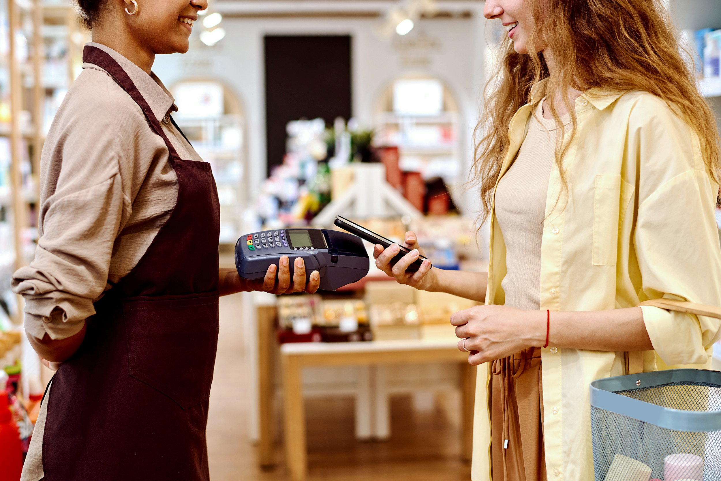
Loyalty programs: How to choose the best martech platform?
Martech for loyalty programs is like an invisible spinal column. It's impossible to operationalize a …

Why integrate gamification into a loyalty program?
Steps for integrationCanadians are increasingly participating in gamification activities within loya …

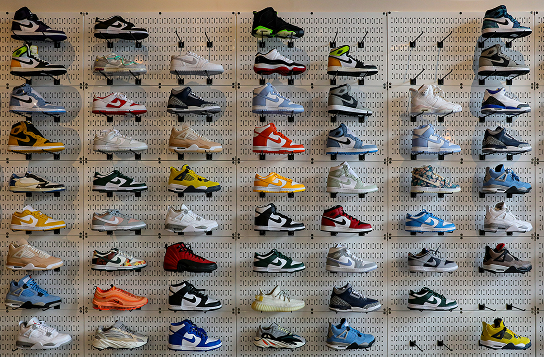
Top 10 best loyalty programs in Canada
Technology is evolving, as are consumer expectations. That means loyalty programs are changing too.

Meta Andromeda: An AI revolution in paid social?
Meta Andromeda is being presented as a radical turning point in advertising performance on Meta plat …

How artificial intelligence is transforming customer experience (CX)
For a long time, artificial intelligence (AI) was perceived as a futuristic vision. Today, AI is no …

Your next step: Adobe Customer Journey Analytics
Do you already use Google Analytics 4 but find that your analytics questions are becoming increasing …

Uncertain times: How can (and must) B2C brands adapt?
In recent months, the political climate has shifted the concerns of Canadians from “The cost of groc …

With AI controlling Google Ads, what if marketers lose their expertise?
Inspired by Digital Marketing in an AI World by Frederick Vallaeys

The era of AI and instant answers: How to reposition your brand to exist without clicks
Search behaviours are changing fast. With the rise of ChatGPT, Gemini, Copilot, and the answers prod …
The two aspects of loyalty program performance
Most articles and discussions on the topic of loyalty programs are essentially about their design. P …
Shopify e-Commerce Tracking: Solutions for 2025
Since April 2025, Shopify has been changing the game when it comes to e-commerce tracking. Tradition …

4 MarTech trends that are redefining the future of marketing
As the digital transformation speeds up, marketing technologies (MarTech) are evolving at an unprece …

Content Security Policy (CSP): Is your web security blocking your data?
Today, content security policies (or CSPs) are considered indispensable to protecting your websites …

The fall of the Bay: What retailers should learn from it
The announced closure of Hudson’s Bay stores marks the end of an era for arguably the most emblemati …

8 trends in loyalty in 2025
Given that over 19 loyalty programs have a presence in Canadians’ wallets1, which represents signifi …

AI agents: The future of productivity starts now
The heightened interest in generative artificial intelligence (AI), specifically in AI agents and la …

Sustainable media strategy: Combining performance with environmental responsibility
Because they are energy intensive, media play a key role in the fight against climate change. The go …

Artificial Intelligence (AI): Solutions for Ethical and Sustainable Use
Artificial intelligence (AI) has become an essential component of many human activities, transformin …

The top 10 best loyalty programs in Canada in 2024
This past fall, R3 Marketing and Adviso, in collaboration with Ad hoc Research, unveiled the 7th edi …

Will Search GPT replace Google? What you should do to stay on top of the situation
The short answer: Search GPT will not be replacing Google in the near future, but it will redefine o …
Find and leverage what really matters.
Get our insights and recommendations to stay ahead in the marketing landscape.