Analyze your color contrasts
What could be more frustrating than a design discussion going around in circles? How to make an evaluation of a new design more unbiased so as to avoid “I like this, but not that”? The contrast ratio is a criterion that is often overlooked when evaluating a design. And it also allows you to close a debate with a less subjective argument.
The contrast ratio is also an element that influences the ease of navigation of your site (does the fashion for gray text on websites ring a bell?). We sometimes forget the number of people who have at least one vision problem. Can you guess the percentage? 10%, 15%, 20%, 30%….or more?
51% of the Canadian population (12 years and over) have a vision deficiency (2003 CCHS). WOW!
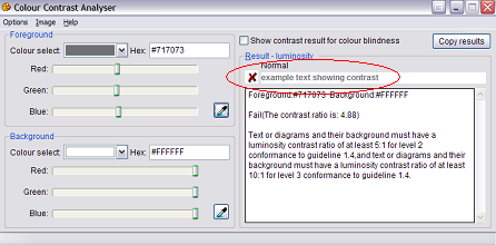
It is possible to easily calculate the contrast ratios for your site. But unfortunately few site managers bother to do so. I suggest you use the ‘colour contrast analyzer’ tool to automatically calculate color contrasts. It offers a very user-friendly color selection tool right on the screen, no need to guess the code of the colors you want to analyze.
The software allows you to:
- Calculation of color contrast
- Calculation of color brightness ratio
- Simulate the effect of certain vision disorders

(Example of simulation on the site cyberpresse.ca)

(here is an example of how gray text on a white background does not meet accessibility standards)


.jpg)


