Marketing Analytics Analyst
Google Data Studio: Creating a clear, precise dashboard
Marketing Analytics Analyst
In the era of big data, the benefits of having a dashboard are clear. Still, what makes a good dashboard is its ability to tear down silos and restore data to a centralized, digestible and interactive form. A good dashboard is an indispensable decision-making tool for your internal teams.
Data Studio has emerged as a solution of choice due to its price tag (free) and its integration with a wide array of platforms across the digital ecosystem. Connecting offline behaviour data is also an option, whether it’s through native integration with other Google products or through a connector (Supermetrics, Funnel, etc.). Since it launched in 2016, the platform has been continually improving its functionalities with updates ranging from data connection to dynamic data visualization, including enriched data.
Before plugging in the data connector, it’s important to ask yourself a few questions to help guide the dashboard creation process and ensure that you are putting the user at the heart of the process:
- Define what data in the dashboard will be connected to business goals, and what approach you’ll take (e-commerce performance monitoring, marketing channel monitoring, ad hoc analysis, etc.) when it comes to:
- Defining key metrics and their context
- Choosing the right charts to effectively convey your message
- Define who the dashboard users will be, specifically their profile within the company (marketing team, communications, etc.) in order to:
- Validate their information needs
- Validate how they will use the dashboard (direct link, PDF, etc.)
Getting started on the right foot is both an art and a science
Much like an intuitive online shopping experience, a dashboard needs to be designed and built in a way that supports the user as they navigate through condensed data, and helps them interpret the charts.
As a result, concepts inherent to CX, specifically design and cognitive psychology, are extremely useful in the configuration of a dashboard. Here are a few that jump out:
Cognitive load
With any intellectual exercise, human beings call upon their faculties of reflection and analysis in order to grasp information quickly and accurately — not an easy thing when our eyes are glued to a dashboard. That’s where psychology intervenes to reduce the cognitive load.
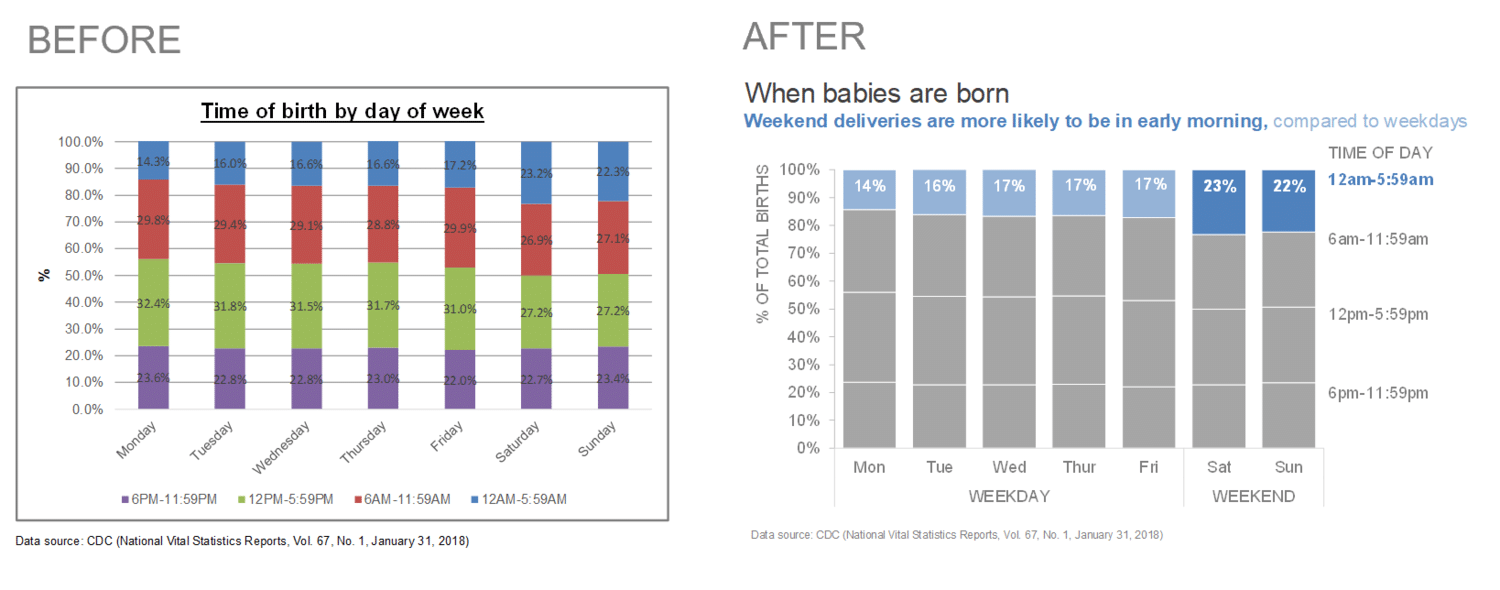
Essentially, the goal is to eliminate any elements in the graph that take up visual space without adding value or helping the user better understand the data. Thanks to the six Gestalt principles of human perception, charts treated in this way get a qualitative facelift, as illustrated in the image below:

(Source: Storytelling with data)
Preattentive attributes
The cognitive process involves a certain amount of reaction time. Preattentive attributes allow us to focus on visual properties and therefore, grab the user’s attention to stimulate immediate understanding. This translates to the size, colour and position of an element on the page.
-png-1.png?width=732&name=2%20(1)-png-1.png)
(Source: Storytelling with data)
Now that you understand the importance of visuals in a dashboard, let’s look at the tools specific to Data Studio that can help you organize your data.
Google Data Studio’s indispensable functionalities
Calculated fields
Calculated fields are used to shape existing data by creating personalized dimensions and statistics. These are added to your charts to enhance your reporting with mathematical functions (complete goal ratio), aggregation (accumulation of goals), text (concatenation of UTM parameters) and dates (calculation of the duration of an ad campaign).
The creation of a calculated field can happen on two different levels:
- The data source: the addition of a new dimension/metric is done after the data is connected which allows it to be used more than once in the report by selecting that field.
- The chart: created directly in a specific chart, the calculated field cannot be reused elsewhere without reproducing the formula. This is useful for refining the data in a chart without necessarily going back to the data source.
Take the example of a group of channels in Google Analytics. For various reasons, these might include inconsistencies when it comes to source/medium. Thanks to branching logic, it’s possible to reorganize your channel sources in a way that makes reporting tidy and relevant.
-png.png?width=797&name=3%20(1)-png.png)
Data Blending
Having only a single data source can start to feel less than exciting when you’re analyzing performance. In the world of search visibility, contextualizing data from Organic Search vs data from Paid Search leads to a better understanding of the results, so you can distinguish high interest keywords for a particular channel and compare metrics.
With data blending, Data Studio provides some answers to the problem above by combining multiple data sources (up to 5) that share a common dimension, or “join key.”
Essentially, it’s possible to either combine a data source with itself (by creating, for example, ratios for a single metric like the % of users who’ve read the blog), or to combine it with different data sources.
Here, too, there are two distinct ways to set up data blending:
- The first consists of grouping data sources together using the top menu, by clicking “Resource > Manage blended data.” Then, select the dimensions and metrics you want to compare. Once you’ve chosen your visualization, simply choose the newly created data source in the “data source” bar.
- The second way allows you to create a blended chart from a selection of charts, which Data Studio uses to automatically generate a blend. To make an edit, simply click “Manage mixed data” from the top menu, then choose your data source.
However, data blending does have limits, such as the type of joining it allows. Data Studio only supports left outer join operations, which means that data on the right side without an equivalent on the left will not be displayed.
Tip: make sure that the left side covers a broad period, large enough that the right side is implicitly covered and all associated data is displayed.
Filters
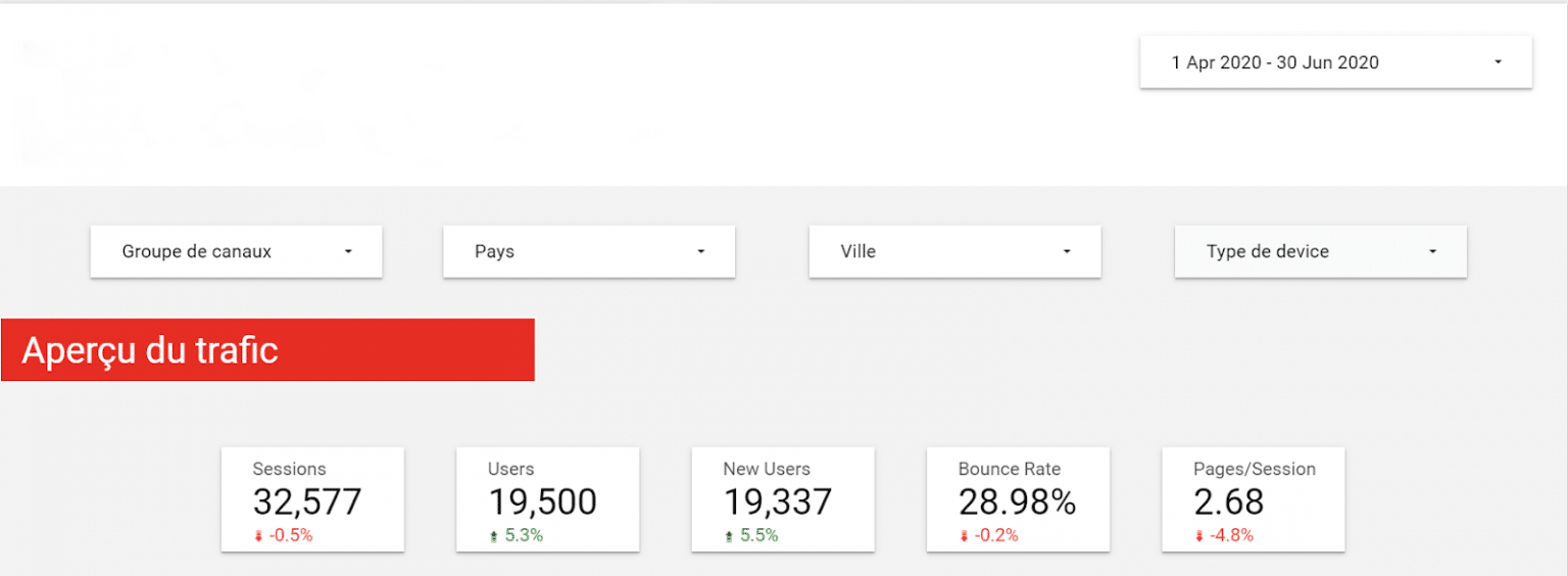
Not only do filters allow you to personalize the way data is presented to users (for example reporting traffic for “social” so the source is “Facebook”), it also allows the same users to appropriate the report however they see fit so they can navigate more easily (juggling between filters by selecting, for example, a particular segment of visitors: users who live in “Montreal,” visited from a “mobile device” and arrived through the “email” channel).

Data Studio offers a variety of filters from a simple filter command to chart interaction filters. Filters are easy to configure and can be limited to a handful of graphs.
The date range command is also included here. The user can choose to stick with the predefined period or select a date range from among a fairly expansive list (past 7 days, past month, past quarter, past year, etc.).
It’s worth noting that interaction filters can apply to all charts except bullet charts and data tables. In addition, a graph can have a personalized date range that is different from the one selected in the filter.
Report management
Beyond accessing reports through the URL, Data Studio offers other options for viewing reports:
- PDF format: can either be sent automatically by email, or downloaded from the URL by selecting the entire report or just certain pages
- Spreadsheet format: click on the three points found above the graph while choosing the extension CSV or Gsheet
As for sharing reports, Data Studio offers various possible methods, depending on the number of users with different levels of access (read or edit). You have the option of giving access to:
- Specific people with Gmail addresses
- Users with an address associated with a Google account (including G suite)
- All employees of a company whose email addresses share the same domain
While sharing a report, you can also share a data source, which would then allow you to cede control to a new owner. This constitutes a major advantage for advertisers who want to keep control over their reporting mechanisms. Still though, you have to make sure that the transfer is done to addresses with a common domain.
Reporting templates
Data Studio is meant to be a rapid data visualization tool that gives dashboard creators access to functional reporting templates, adapted to a multitude of platforms and requiring just the insertion of a data source and eventually, a few adjustments to customize it to your taste. They are provided both by the Data Studio team and by professionals at the top of their fields.
Still, it might be interesting to build your own personalized models for recurrent reports in order to improve agility and efficiency.
Happy analysis!


