The footer is often an overlooked part of a website. Why ? Probably because visitors are not used to using it. But if the footers were better constructed, we might use them a little more. Few footers provide value. We are starting to see a trend that revalues the footer. Here are ideas for increasing the value of your footers along with examples of good sites. Let's fight footer isolation together.
13 TIPS TO IMPROVE YOUR FOOTER:
- Repeat your website's primary navigation
- Promote your recent or popular content
- Have an about section or link to it Functional links (ex: site map or to the top of the page)
- Encourage action/loyalty (e.g. newsletter or RSS subscription, gift card)
- Add contact information or a link to it
- Reinforce branding by repeating your logo
- Optimize your SEO
- Help your visitors by directing them to customer service
- Promote your affiliate or content partner sites
- Build trust by having certification logos
- View legal information and links to details
- Repeat your search engine
We obviously can't put everything in a footer, so we have to contextualize it with the needs and specificities of the site. In closing, here are some examples of good footers:


Design an ergonomic homepage
The homepage is usually the most visited page of a website. It is often the first page that we consult and if this is not the case, we generally return quickly to the home page to explore a site. Much like a storefront, the homepage gives a first impression of your site and directs the potential buyer. Here are the basics of a well-built landing page that respects conventions.
Improve user experience through geolocation
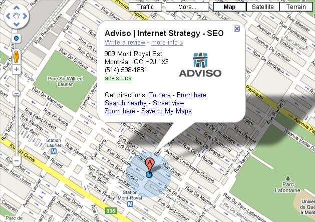
Since my transition to version 3.5 of Firefox and the use of its geolocation module by Google maps, I have rediscovered the magic of "you are here" on the interactive Google map .

27 practical tips on web ergonomics: a summary
When web ergonomics is discussed, web usability is often mentioned. Web usability is the notion of defining the ease of use of an interface for a particular group of users within a particular context. Evaluation is based on three aspects: efficiency, meaning the possibility of the user reaching their goals, efficience, which takes into account the necessary efforts to reach these goals and satisfaction. Note that together these criterions have an important impact on visitor loyalty.