Design an ergonomic homepage
The homepage is usually the most visited page of a website. It is often the first page that we consult and if this is not the case, we generally return quickly to the home page to explore a site. Much like a storefront, the homepage gives a first impression of your site and directs the potential buyer. Here are the basics of a well-built landing page that respects conventions.
The goals of a good homepage are to establish the foundation for site navigation (to direct it to the user's goal) as well as to educate the user about the content that is in the site. A good page should also encourage people to discover the site. Here is a functional mockup with the most common elements of a homepage with the location to respect.
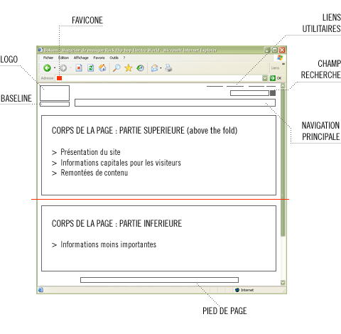
(image from ergo lab)
- Favicone: Small logo in the address bar that identifies the site in browser tabs as well as in bookmarks.
- Logo: The logo is one of the most viewed elements by new visitors to your site. The user's eyes begin to roam the site in the upper left corner. To reinforce the site's brand, it is therefore recommended to place the site's logo there.
- Baseline: Half-slogan & half-theme, this element should give the visitor some idea of the purpose of the site. The less the site is known, the more important this element is as a landmark.
- Utility links: Allows the user to perform specific tasks such as finding the contact section, connecting to a secure area, changing the language, the sitemap, etc.
- Search: The location of the search engine varies from site to site depending on the type of site. It should be easily identifiable and placed at the top of the site.
- Main menu: The main menu is generally at the top of the site, but sometimes also on the left for sites with fewer pages.
- Body of the page: This section varies from site to site. We recommend placing the priority content above the fold, the page should not be overloaded and it is preferable to limit the number of columns to 3.
- Footer: The bottom of the page should not be overlooked. We usually repeat the navigation of the site. You can also include a link to return to the top of the page. The links to the terms of use are also at the bottom of the page.
As a bonus…don’t forget that the site must meet the needs of the customer above all!
Expertises évoquées
(SizeLimitingPyList: [Tech, Client experience & UX])TechHow-ToBusinessBusiness StrategyPaid Media & SEMAnalytics & TrackingClient experience & UXContent & SEOSocial MediaInnovationDigital transformationE-commerceData Science & AI MarketingAdvisoOpinionsArtificial Intelligence MarketingSeriesCustomer-centric marketingContentProject ManagementUnderstand the impactsAcquiring durable audiencesEmail marketingGDPRAI MarketingCookie ApocalypsePersonalizing the customer experienceRaise awarenessCreating a value exchange programMarTechMarketing AutomationMeasuring and optimizing initiativesPrivate: Cookie ApocalypseBrandingFacebook AnalyticsLoyaltyOne-on-oneCOMMERCECtrl+A | A Podcast About Digital StrategyFacebook AnalyticsFind solutionsInnovationInsiderSecret weaponsTHOMA DANEAUWebinars
You May Also Like
These Related Stories

Will 2017 finally be the year landing pages take off?
2017, the year of mobile? Been there, done that. 2017, the year of conversion? Maybe. Either way, if it was up to me it would be: 2017, the year of the landing page. Only 10% of Quebec companies are currently equipped with campaign-specific landing pages for their digital marketing campaigns. From that we can deduce that 90% of Quebec companies could significantly improve the performance of their marketing campaigns by working on their landing pages.

What if 2017 finally marked the take-off of landing pages?
2017, the year of mobile? Déjà vu. 2017, the year of conversion? Maybe. In any case, if I had to give you my wish for this year, it would be this: 2017, year of the landing page . Only 10% of Quebec companies are now equipped with landing pages dedicated to their web marketing campaigns . We can therefore conclude that 90% of Quebec companies could greatly improve the performance of their marketing campaigns by working on their landing pages .

Faire une bonne page 404 — 10 conseils
La page 404 donne toujours l’impression d’être arrivé dans un endroit inexploré d’Internet. Un genre de trou noir du web qui peut vous aspirer n’importe où, et bien souvent nulle part. Si l’utilisateur est déjà dans le site, il va sans doute revenir en arrière, mais qu’en est-il lorsqu’il arrive sur cette page à cause d’un URL non valide? Il va sans doute lui aussi revenir en arrière pour ne plus jamais revenir! Avec un peu d’effort, on peut minimiser les effets pervers d’une page 404.
Repérer et valoriser ce qui compte vraiment.
Recevez nos analyses et conseils pour rester à l’avant-garde du numérique.
