Last updated on Mar 30, 2026 4:46:09 PM
The footer is often an overlooked part of a website. Why ? Probably because visitors are not used to using it. But if the footers were better constructed, we might use them a little more. Few footers provide value. We are starting to see a trend that revalues the footer. Here are ideas for increasing the value of your footers along with examples of good sites. Let's fight footer isolation together.
13 TIPS TO IMPROVE YOUR FOOTER:
- Repeat your website's primary navigation
- Promote your recent or popular content
- Have an about section or link to it Functional links (ex: site map or to the top of the page)
- Encourage action/loyalty (e.g. newsletter or RSS subscription, gift card)
- Add contact information or a link to it
- Reinforce branding by repeating your logo
- Optimize your SEO
- Help your visitors by directing them to customer service
- Promote your affiliate or content partner sites
- Build trust by having certification logos
- View legal information and links to details
- Repeat your search engine
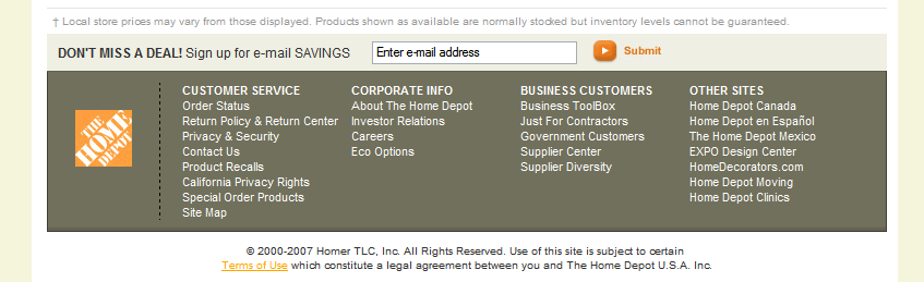
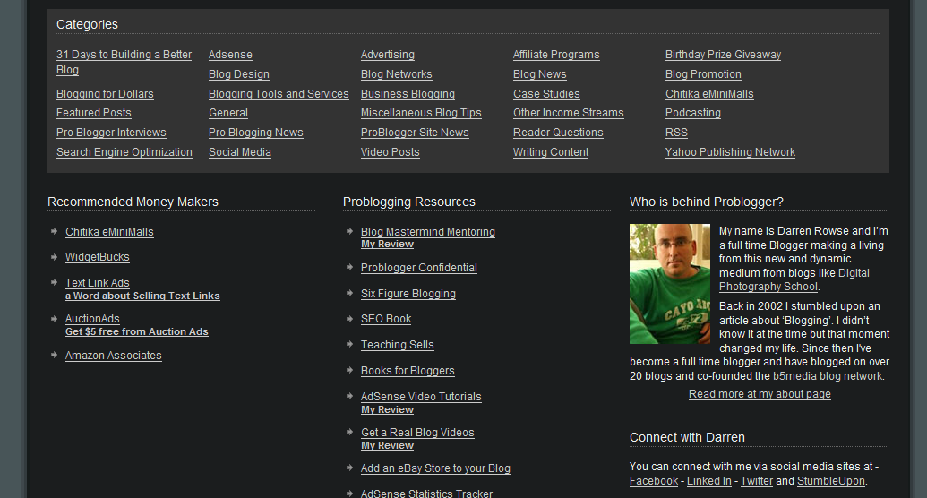
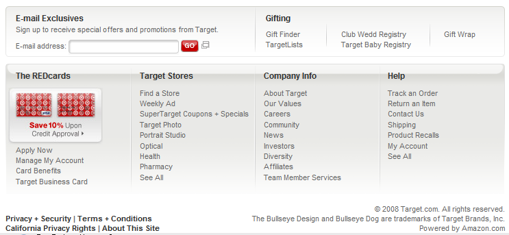
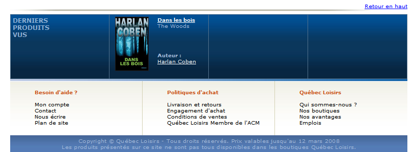
We obviously can't put everything in a footer, so we have to contextualize it with the needs and specificities of the site. In closing, here are some examples of good footers:
Share this